Articles
How to Create an Effective Infographic: Design Tips, Examples and Common Mistakes
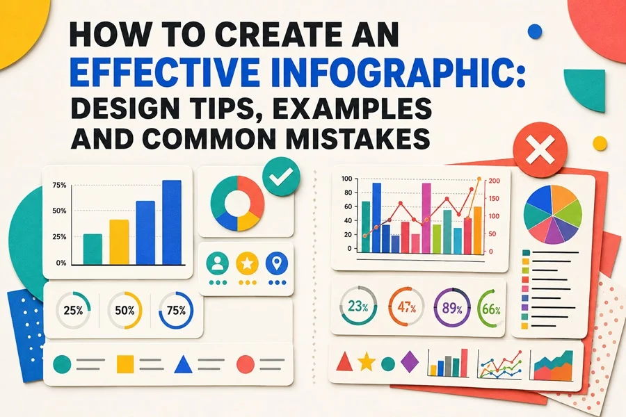
A practical guide to turning complex information into a clear, accurate and visually engaging story.
An effective infographic does more than decorate information. It gives content structure, reveals relationships and helps readers understand the main point quickly. Good infographic design combines editorial thinking, accurate data and visual discipline. Every color, chart, icon and line of text should make the message easier to follow.
The process becomes faster when you begin with a clear plan and use reusable visual components. If you need a flexible starting point, explore infographic templates that can be adapted for reports, presentations, websites, marketing campaigns and social media. The following principles will help you customize those resources — or build an infographic from scratch — without sacrificing clarity.
CORE PRINCIPLE The reader should notice the message first and the design second. If the layout needs to be decoded before the content can be understood, the design is working against the information.
What Makes an Infographic Effective?
The best infographics feel simple even when the subject is complicated. That simplicity is not created by removing all detail; it comes from deciding what deserves attention, organizing it in a logical order and presenting it with a consistent visual language.
A strong infographic usually has five qualities:
1. Clarity. The subject and main conclusion are immediately understandable.
2. Focus. The design answers one central question instead of competing with several unrelated messages.
3. Accuracy. Numbers, labels, scales and comparisons represent the information honestly.
4. Hierarchy. The layout tells readers where to begin, what to notice next and which details are supporting evidence.
5. Consistency. Colors, type, icons, charts and spacing behave according to a small set of repeatable rules.
An infographic can be visually impressive and still fail if the main idea is hidden. It can also be accurate but ineffective if the audience cannot scan it comfortably. Treat usefulness and aesthetics as parts of the same design problem.
Start with a Communication Goal
Before opening Illustrator or choosing a template, write a one-sentence brief. A useful formula is: “After viewing this infographic, the audience should understand ___ and be able to ___.” This forces you to define both the message and the desired outcome.
Answer these questions before designing:
1. Who is the audience, and how familiar are they with the subject?
2. What is the single most important conclusion?
3. Which facts are essential, and which can be removed?
4. Where will the infographic appear: a presentation, report, landing page, social post or printed page?
5. What should the reader think, remember or do after viewing it?
The publication context matters. A vertical graphic for a website can reveal information gradually, while a presentation slide must communicate from a distance. A social graphic may need one strong insight rather than a complete report. Decide the format early so you do not squeeze finished content into the wrong canvas later.
Choose the Right Infographic Format
The structure should follow the information. Do not select a layout simply because it looks attractive. Identify what the reader needs to compare, learn or complete, then choose the format that supports that task.
1. Statistical infographics. Best for key figures, survey results and performance summaries. Emphasize large numbers, concise labels and only the charts that support the main point.
2. Comparison infographics. Useful for products, plans, options and before-and-after states. Use parallel sections, matched criteria and consistent scales.
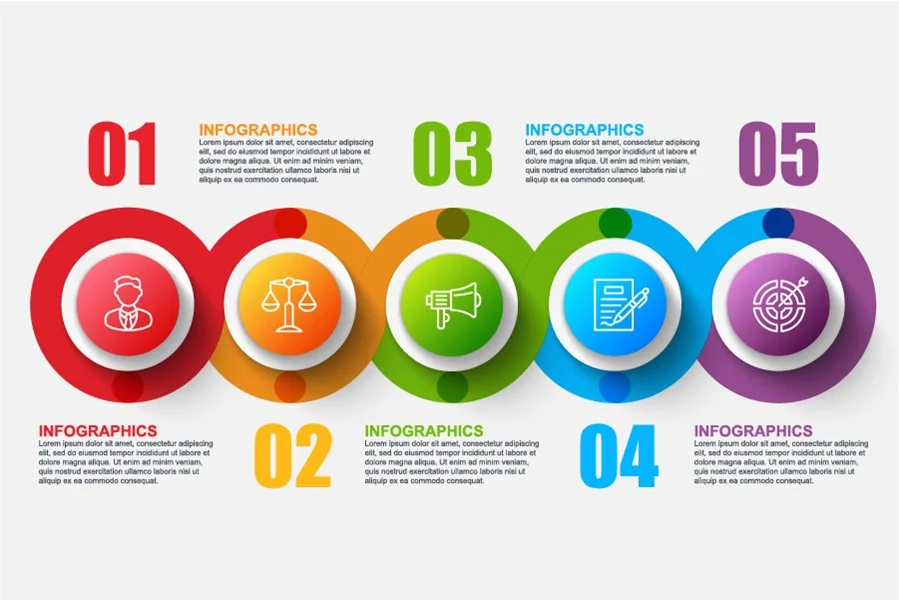
3. Process infographics. Appropriate for workflows, instructions and sequences of actions. Use numbered stages, clear directional cues and concise descriptions.
4. Informational infographics. Good for explaining a concept, service or unfamiliar subject. Divide the content into clear sections supported by icons and short text.
5. Geographic infographics. Use them for regional differences, locations and spatial patterns. Keep maps legible and limit labels to what matters.
6. Hierarchical infographics. Best for levels, categories, priorities and organizational relationships. Show grouping, scale and alignment consistently.
Many projects combine two formats. A business report might begin with several headline statistics and continue with a comparison of departments. Combining formats is useful when each section has a clear role; it becomes confusing when every section introduces a new visual system.
Organize the Content Before Styling It
A content-first wireframe prevents decorative choices from controlling the message. Work in grayscale and represent charts, images and text with simple boxes. At this stage, you are testing order, proportion and emphasis—not colors or illustration styles.
A reliable content structure
1. Headline: state the subject or the main finding in plain language.
2. Context: give the reader enough background to understand why the information matters.
3. Main sections: divide the subject into a small number of meaningful groups.
4. Evidence: use data, examples or concise explanations to support each point.
5. Conclusion: summarize the takeaway or provide a clear next action.
Give every section a job. If two sections communicate the same idea, combine them. If a paragraph requires several sentences, consider shortening it, separating it into labeled points or moving the detail to a companion article. An infographic should be able to stand alone, but it does not need to contain every fact from the source material.
Build a Strong Visual Hierarchy
Visual hierarchy controls attention. Readers should be able to skim the page and understand its structure before reading every word. Hierarchy is created through size, contrast, position, spacing and repetition—not through size alone.
1. Make the main headline clearly larger than section headings.
2. Give one or two key numbers the strongest visual emphasis.
3. Group related information with consistent spacing and alignment.
4. Use accent color selectively so it retains meaning.
5. Keep secondary explanations quieter than the data they support.
Test the hierarchy by zooming out until the body text becomes unreadable. You should still see the headline, major sections, primary values and overall reading direction. If everything appears equally important, the design needs stronger priorities.
QUICK TEST Show the draft to someone for five seconds, then hide it. Ask what the subject was and which point appeared most important. Their answer will reveal whether your visual hierarchy matches your intention.
Match the Chart to the Question
Charts are tools for reasoning. Choose them according to the relationship in the data, not according to novelty. A familiar chart that communicates immediately is usually more valuable than an unusual visualization that needs a long explanation.
1. Comparing categories. Use a horizontal or vertical bar chart. Keep one scale and order the categories meaningfully.
2. Showing change over time. Use a line chart with consistent intervals and label the most important changes.
3. Showing parts of a whole. Use a stacked bar or simple donut chart. Limit the number of segments and display the total.
4. Exploring relationships. Use a scatter plot, but do not imply causation unless the evidence supports it.
5. Showing a distribution. Use a histogram or range plot with sensible intervals, and explain unusual values.
6. Presenting exact values. Use labeled number cards or a simple text list, and avoid turning precise values into decorative shapes.
Avoid misleading visualizations
A circle that represents twice the value must be scaled by area, not simply made twice as wide. When precision matters, label the numbers directly and keep decorative elements separate from the measurement system.
Use the same color for the same category throughout the design. If green represents completed work in one chart, it should not represent a different department in the next. Consistent encoding reduces the amount of interpretation required from the reader.
Use Color as an Information System
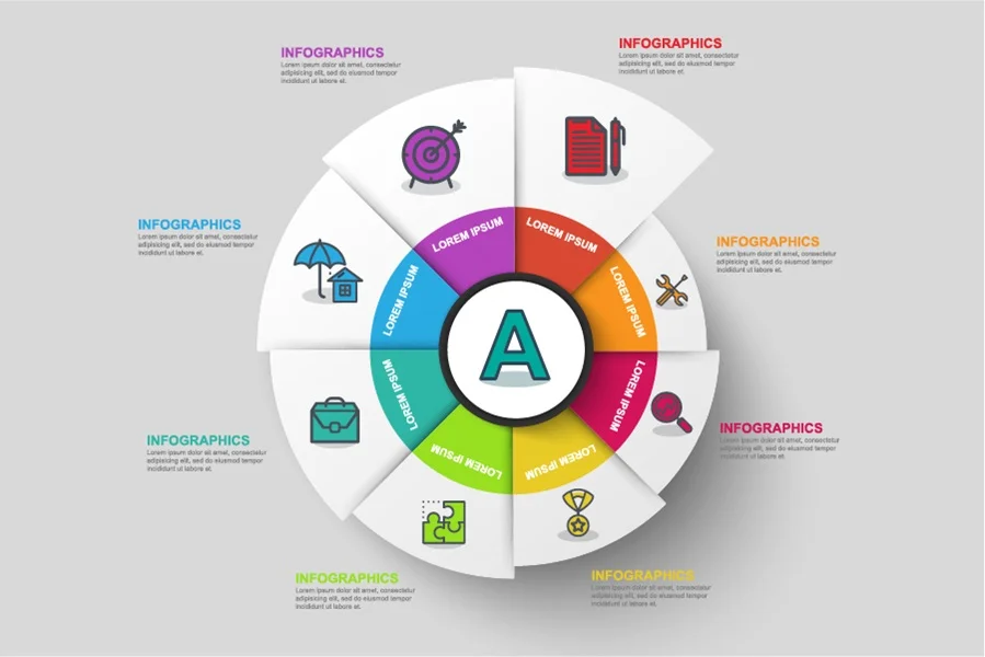
Color should organize information before it decorates the page. Begin with neutrals for backgrounds, text and supporting lines. Add one primary brand color and one accent color for emphasis. Additional colors should have a defined role, such as separating categories or showing status.
Practical color rules
1. Use a restrained palette. Three to five functional colors are enough for most infographics.
2. Reserve the strongest color for key findings, active states or calls to action.
3. Check text contrast, especially when white type appears on colored backgrounds.
4. Avoid relying on red and green alone to communicate success and failure.
5. Test the design in grayscale. Important distinctions should not disappear completely.
For screen-based infographics, normal text should generally meet a contrast ratio of at least 4.5:1, while large text should reach at least 3:1. Even when a design is not legally required to meet a particular accessibility standard, good contrast improves readability for everyone.
Choose Typography for Fast Reading
Infographic typography must work at several levels: headline, section heading, key statistic, label and supporting explanation. Create those styles before filling the page so type remains consistent from beginning to end.
1. Use one type family with several weights, or pair two compatible families.
2. Keep labels short and place them close to the information they describe.
3. Avoid long centered paragraphs; left-aligned text is easier to scan.
4. Do not reduce body text merely to make more content fit. Edit the content first.
5. Use capitalization consistently and avoid writing entire sentences in uppercase.
Typography can also carry meaning. A bold weight can signal the conclusion, while a regular weight handles explanation. Color can distinguish a value from its unit, but the information should remain understandable without color. Every typographic difference should communicate hierarchy, not simply add variety.
Add Icons and Illustrations with Purpose
Icons help readers identify subjects quickly, while illustrations can establish tone and make abstract concepts more approachable. Both work best when they support the information rather than compete with it.
Use components from the same visual family whenever possible. Consistent stroke widths, corner shapes, proportions and colors make a design feel intentional. Ready - made infographic elements are especially useful because charts, icons, labels and decorative shapes are already designed to work together. You can recolor and rearrange them while preserving a unified style.
Icons are most useful when they
1. introduce a section or category;
2. reinforce a familiar action or concept;
3. help readers navigate repeated content blocks;
4. replace a label only when the symbol is universally recognizable.
Do not use icons as quantitative units unless every icon has equal size and clearly represents the same amount. Avoid mixing detailed illustrations with minimalist line icons unless there is a deliberate visual reason. When illustrations are decorative, keep them away from chart axes, labels and other areas where they could be mistaken for data.
Use Alignment and White Space to Create Order
A grid gives unrelated content a shared structure. Define consistent outer margins, column widths, gaps and alignment points. Elements do not need to be identical, but their edges should relate to one another. Small alignment errors make even good components look unfinished.
White space is not wasted space. It separates sections, protects the headline, improves reading speed and creates emphasis without another color or shape. Increase spacing between unrelated groups and reduce it between items that belong together. This simple proximity rule often improves clarity more than adding borders or backgrounds.
Design for Accessibility and Different Screens
An infographic should remain understandable for people with different visual abilities and on different devices. Accessibility is easiest to achieve when it is considered from the beginning rather than added after the layout is complete.
1. Do not communicate meaning through color alone; add labels, patterns or symbols.
2. Use direct chart labels when space allows instead of forcing readers to move repeatedly between a chart and legend.
3. Write alternative text that explains the main conclusion, not every decorative detail.
4. Maintain a logical reading order for headings, text and data.
5. Check the design at the actual size it will be viewed.
For responsive websites, consider creating more than one composition. A wide desktop layout may need to become a single-column mobile version rather than simply shrinking. Preserve the content hierarchy across versions even when the position of individual elements changes.
Common Infographic Design Mistakes
Trying to say everything
Too much content weakens the main message and forces the designer to reduce text, spacing and chart size. Decide what the reader truly needs and move supporting detail to a separate page or article.
Choosing a style before understanding the information
A fashionable layout may not fit the content. Begin with the communication goal, structure and data relationships. Apply the visual style only after the information architecture works.
Giving every element equal emphasis
When every statistic is large, every section is colorful and every icon is prominent, nothing stands out. Choose a primary insight and create quieter levels for supporting information.
Using the wrong chart
A chart can be technically correct but difficult to interpret. Match the visualization to the reader’s question and compare it with a simpler alternative before committing to the design.
Adding too many colors, fonts and icon styles
Variety does not automatically create interest. A small design system makes information easier to scan and gives the finished infographic a professional identity.
Decorating data in a misleading way
Unequal scales, cropped axes, exaggerated symbols and perspective effects can change the apparent relationship between values. Accuracy must remain more important than visual drama.
Making text too small
A layout that is readable at full editing size may fail in a presentation, social feed or mobile browser. Test the final output at realistic dimensions and remove content instead of shrinking it beyond comfortable reading size.
Forgetting context and sources
Numbers need units, dates and definitions. Explain what was measured, over which period and according to which source. Source information can be visually quiet, but it should never be absent when readers need it to judge credibility.
A Practical Infographic Design Workflow
1. Define the message. Write the main conclusion in one sentence.
2. Edit the content. Remove repetition, verify facts and group related points.
3. Choose the format. Match the structure to the reader’s task and publication channel.
4. Create a wireframe. Arrange content blocks in grayscale before styling them.
5. Establish hierarchy. Set headline, heading, statistic, label and body-text levels.
6. Select charts. Use the simplest accurate visualization for each relationship.
7. Build the visual system. Define colors, typography, icons, spacing and grid rules.
8. Refine the details. Align edges, shorten labels and remove unnecessary decoration.
9. Review with fresh eyes. Test comprehension, accessibility and readability at final size.
10. Export and check. Confirm dimensions, file format, color mode and image quality.
Choose the Right Export Format
The best file format depends on how the infographic will be edited and published. Keep an editable master file, then create delivery versions for specific channels.
1. AI is ideal for editing the original artwork in Adobe Illustrator.
2. EPS is useful for compatibility with many professional vector applications.
3. SVG is a strong choice for responsive web graphics because it remains sharp at different sizes.
4. PDF is reliable for sharing, review and many print workflows.
5. PNG is useful for web publishing when transparency or a fixed raster image is required.
6. JPG creates compact images for platforms that do not require transparency, but it should be exported at sufficient quality.
Before publishing, inspect the exported file rather than assuming it matches the working document. Check small labels, line weights, transparency, color changes and any elements placed near the canvas edge.
Four Effective Infographic Examples
Business performance summary
Lead with three or four key performance indicators, followed by a bar chart comparing departments and a short section explaining the strongest change. The design works because it moves from overview to comparison to interpretation.
Marketing campaign report
Begin with the campaign goal and primary result. Group reach, engagement and conversion metrics into separate blocks, then use one accent color to highlight the best-performing channel. Finish with two evidence-based recommendations.
Sustainability report
Organize the content by measurable themes such as energy, materials and waste. Give each theme a consistent icon and color, but keep the numerical treatment identical so readers can compare progress without relearning the layout.
Educational concept guide
Use a concise definition, a diagram of the core idea, several labeled examples and a final recap. Illustrations can make the subject approachable, while clear headings ensure the graphic remains useful as a reference.
Final Infographic Checklist
1. The main message can be summarized in one sentence.
2. The headline and key insight are visible at a glance.
3. Every section supports the communication goal.
4. Charts match the questions being asked and use honest scales.
5. Labels, units, dates and sources are complete.
6. Colors have consistent roles and sufficient contrast.
7. Typography is readable at the final viewing size.
8. Icons and illustrations share a consistent visual style.
9. Alignment, spacing and section grouping are consistent.
10. Meaning does not depend on color alone.
11. The design works on its intended screen or printed format.
12. The exported file has been checked for quality and accuracy.
Conclusion
Creating an effective infographic is an exercise in editing and decision-making. Start with the audience and message, organize the content before styling it, choose charts that represent the data honestly and build a restrained visual system. When hierarchy, color, typography, icons and spacing all support the same communication goal, complex information becomes easier to understand and remember.
You do not have to create every component from the beginning. To speed up your workflow while keeping the design flexible, explore infographic design resources on specialized sites and customize the colors, content and layout for your next report, presentation, website or marketing project.