Articles
Graphic Design Trends 2026: 12 Styles Shaping Modern Visuals
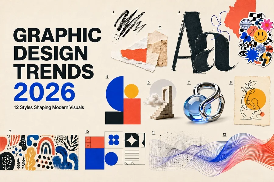
Graphic design in 2026 is defined by contrast. Visual culture is becoming faster, more automated and more technically sophisticated, yet audiences are increasingly drawn to work that feels tactile, personal and unmistakably human. Designers are using artificial intelligence, flexible design systems and immersive digital tools, but they are also returning to hand-drawn marks, collage, expressive typography and imperfect textures.
This tension is creating a richer visual landscape than the one shaped by the polished minimalism of previous years. There is no single dominant look. Instead, brands and creators are choosing from a wider range of graphic design styles depending on the message they want to communicate. A financial platform may use a restrained editorial layout, while a music brand may combine distorted type, layered graphics and kinetic motion. A wellness company may rely on organic forms and warm illustration, while a technology product may use dimensional icons and spatial interfaces.
The most important graphic design trends of 2026 are therefore not isolated visual effects. They reflect larger changes in how people create, evaluate and experience visual content. Audiences have become more sensitive to generic imagery. They recognize repeated templates, predictable AI aesthetics and branding that appears technically correct but emotionally empty. The strongest modern visuals add character, context and a clear point of view.
The following twelve trends show how designers are responding. Some are bold and experimental; others are quiet and practical. Together, they reveal a movement toward design that is more adaptable, more expressive and more connected to the people it is intended to reach.
Imperfect by Design
For years, digital design moved toward flawless alignment, smooth gradients and perfectly controlled visual systems. In 2026, many creators are deliberately introducing irregularity. Uneven outlines, rough brush marks, scribbles, inconsistent spacing and handmade textures are being used to give compositions energy and identity. The goal is not to make work look careless. It is to make it feel authored.
This approach works because imperfections act as evidence of a creative decision. A slightly distorted letter, a torn-paper edge or an asymmetrical arrangement can interrupt the visual sameness produced by templates and automated tools. In vector illustrations, the effect can be created through hand-drawn paths, grain overlays, loose shapes and variable strokes. Because the underlying artwork remains editable, designers can preserve the spontaneity of the style while maintaining production flexibility.
Imperfect design is particularly effective for independent brands, cultural projects, food packaging, events and editorial illustration. It communicates openness and personality. However, the strongest examples still use hierarchy and contrast carefully. When every element is distressed or irregular, the result becomes visual noise. A better method is to combine a stable structure with a few expressive details.
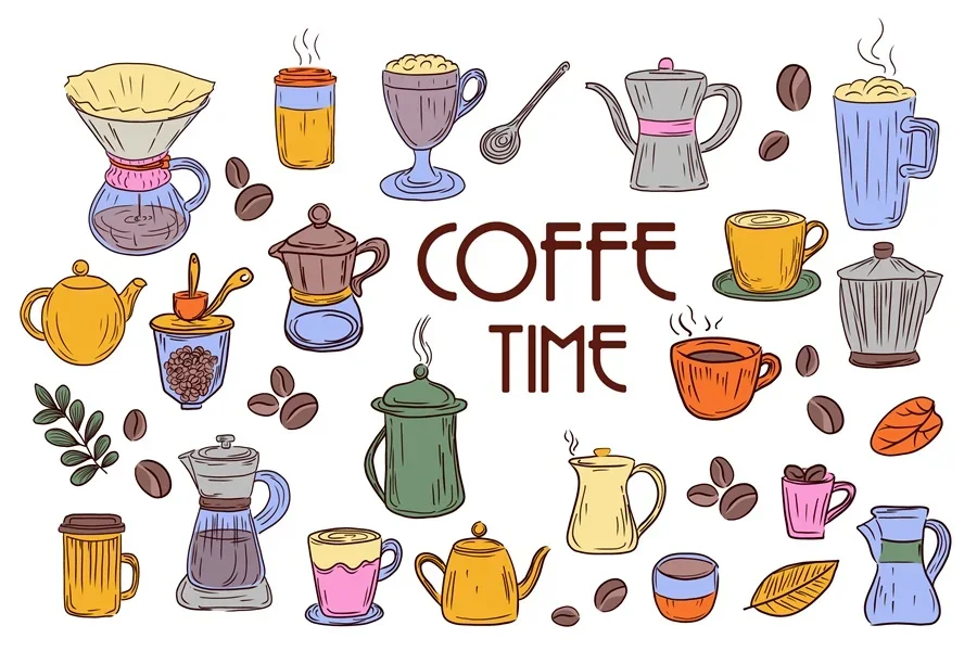
Practical takeaway: Build a clear layout first, then add selected irregular elements that support the tone of the message.
Tactile Mixed Media and Digital Collage
Digital collage continues to expand beyond the familiar combination of photography and paper. Contemporary compositions mix vector shapes, scanned marks, halftones, 3D objects, handwritten notes, transparent materials and fragments of type. The result feels layered and physical even when it is created entirely on screen.
This trend is closely connected to the desire for visual depth. Flat layouts can still be effective, but layers create a sense of discovery. A user notices the main message first and then sees smaller details: a textured shadow, a clipped image, a sticker-like icon or a piece of type placed behind another element. These details reward attention and make a composition more memorable.
For designers working with reusable assets, mixed media offers enormous flexibility. Vector illustrations can form the main structure, while paper textures, grain, Photoshop effects and raster images add atmosphere. The style is useful for posters, social campaigns, album artwork, fashion branding and editorial graphics. It also adapts well to motion because individual layers can be animated separately.
The challenge is maintaining focus. Every layer should contribute either information, emotion or rhythm. Decorative fragments that do none of these jobs should be removed. Good collage looks spontaneous, but its hierarchy is usually highly controlled.

Practical takeaway: Use layers to create depth, but assign every texture, image and vector element a clear visual role.
Expressive and Experimental Typography
Typography is becoming less neutral and more active. Instead of simply carrying a message, type is being treated as an image, a texture and sometimes the central subject of a composition. Designers are stretching letters, shifting baselines, combining unexpected typefaces and using dramatic differences in scale. Serif fonts are also returning in digital environments, often paired with contemporary sans serifs or utilitarian interface type.
The revival of expressive typography is partly a response to years of visually similar branding. Clean geometric sans serifs remain useful, but they no longer guarantee distinctiveness. A custom wordmark, unusual title treatment or carefully selected display face can communicate more personality than a complex illustration. Variable fonts add another dimension by allowing weight, width and other characteristics to change responsively or in motion.
In practice, experimental typography works best when it is concentrated in headlines, posters, campaign graphics and short statements. Body text still needs reliable spacing and readability. The contrast between expressive display type and calm supporting copy can be more powerful than making every line unconventional.
Designers should also test type across different screen sizes. A treatment that feels dramatic on a large desktop layout may become unreadable on a phone. Responsive versions are now an essential part of typographic design rather than an optional adjustment.
Practical takeaway: Let typography create personality in key moments while keeping supporting information direct and accessible.
Creative Maximalism
Maximalism in 2026 is energetic, colorful and deliberately abundant. It uses strong contrasts, multiple visual layers, decorative symbols, bold patterns and oversized typography. Unlike random visual clutter, effective maximalism is built around rhythm. Elements repeat, collide and change scale in ways that guide the eye through the design.
The style reflects a broader desire for participation and self-expression. Audiences do not only want to observe polished brand worlds; they want visuals that feel open to remixing, sharing and personal interpretation. Sticker systems, modular illustrations and vector graphic elements fit naturally into this environment because they can be recombined for different messages and formats.
Creative maximalism is especially visible in entertainment, youth culture, fashion, festivals and social media campaigns. It can help a brand stand out in a feed where restrained designs may disappear. Yet it should be used strategically. Dense compositions are less effective for complex instructions, financial information or tasks that require quick scanning.
A practical maximalist system begins with a limited set of rules: a controlled palette, a consistent illustration style, a small type family and recurring shapes. These boundaries allow designers to create rich visuals without losing recognition or coherence.
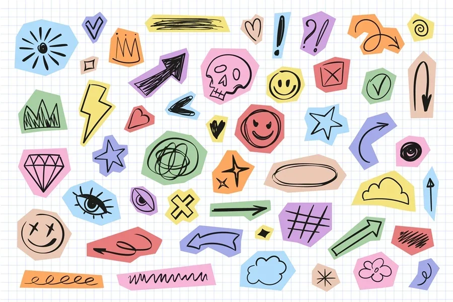
Practical takeaway: Maximalism becomes usable when abundance is supported by repetition, hierarchy and a consistent visual system.
Bold Minimalism and Editorial Clarity
At the same time that maximalism is growing, a more confident form of minimalism is also gaining strength. This is not the pale, generic minimalism that once dominated technology branding. Bold minimalism uses fewer elements, but gives each one greater weight. Large type, precise spacing, strong alignment and restrained color create layouts that feel direct rather than empty.
Editorial design is an important influence. Structured grids, serif headlines, narrow columns, captions and generous margins are appearing in websites, brand presentations and digital products. These devices make information feel considered and trustworthy. They are particularly useful as audiences encounter more automatically generated content and look for signs of selection and judgment.
Vector elements play a supporting role in this style. A single illustration, diagram or icon family can add meaning without overwhelming the layout. Simple shapes and limited colors are often more effective than detailed scenes. The quality of the composition depends on scale, proportion and whitespace rather than decorative complexity.
Bold minimalism is well suited to professional services, publishing, architecture, premium products and technology companies that want clarity without visual anonymity. Its success depends on strong typography and confident editing: when there are fewer elements, every decision becomes visible.
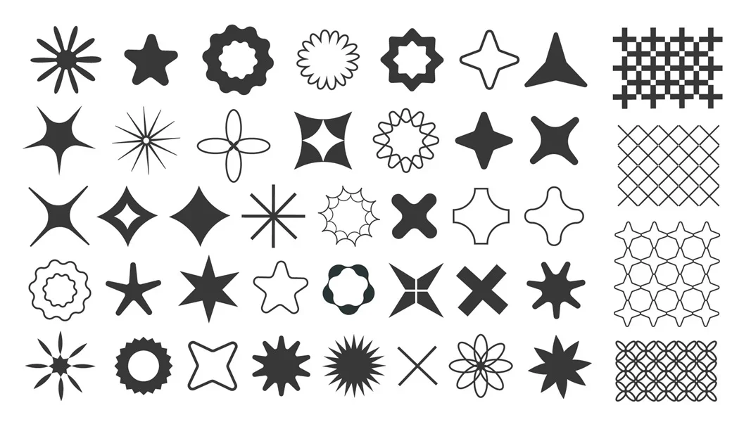
Practical takeaway: Reduce the number of elements, but increase the intention behind scale, spacing, typography and visual emphasis.
Surreal and Absurdist Imagery
Surreal imagery remains influential because it offers an escape from predictable visual logic. Floating objects, impossible proportions, dreamlike environments and unexpected combinations allow brands to communicate ideas that are difficult to show literally. A cloud inside a room may suggest imagination; an oversized everyday object may represent a problem, desire or product benefit.
The most successful surreal design is concept-led. It begins with a clear message and then creates a visual contradiction around it. Without that connection, strange imagery can feel like decoration generated for attention alone. Designers should be able to explain why the unusual relationship supports the story.
Vector illustration is particularly useful for controlled surrealism. Shapes can be resized without losing quality, perspectives can be adjusted and color systems can be changed for different campaigns. Combining vectors with photographic or 3D elements can make the result even more unexpected.
This visual language works well for editorial features, advertising, technology concepts, cultural events and campaigns about abstract topics such as time, creativity or digital identity. It is less suitable when an image must provide precise product information. In those cases, surreal elements should support rather than replace clarity.
3D, Depth and Spatial Design
Depth is becoming a standard part of modern visual systems. Dimensional icons, soft materials, translucent objects and layered interfaces appear across product design, branding and marketing. The current style is less focused on photorealism than earlier 3D trends. Designers are creating simplified objects with tactile surfaces, expressive color and clearly recognizable silhouettes.
This makes 3D more compatible with vector design. A brand can use flat vector illustrations for fast communication and dimensional versions for hero graphics, motion or premium campaign moments. When the same shapes, colors and proportions are maintained, the two approaches can belong to one coherent system.
Spatial design is also influencing interfaces. Cards overlap, menus respond to movement and objects appear to exist at different distances from the viewer. These effects can improve storytelling and help users understand relationships, but they should not interfere with usability. Heavy scenes, excessive blur and unnecessary animation can make a product slower and harder to navigate.
The most useful 3D vector graphics is purposeful. Depth may separate levels of information, demonstrate a product or give an icon stronger presence. It should not be added simply because a rendering tool makes it possible. Performance, accessibility and responsive behavior remain part of the design decision.

Practical takeaway: Use depth to clarify hierarchy or create focus, and always test whether the same message remains clear on smaller screens.
Warm, Personal Illustration
Illustration in 2026 is becoming warmer and more specific. Generic characters and interchangeable corporate scenes are giving way to images with stronger gestures, more varied bodies, recognizable environments and small narrative details. The emphasis is moving from simply filling space to creating a moment that feels observed.
A personal illustration style does not need to be complex. It may be defined by a particular way of drawing hands, a limited palette, a repeated texture or a distinctive approach to proportion. Consistency allows even simple vector elements to become recognizable. The aim is to create a visual voice rather than a collection of unrelated images.
This trend is valuable for brands that need to communicate trust, care or community. Healthcare, education, financial guidance, sustainability and public services can all benefit from illustrations that make abstract processes feel more human. Details should reflect the real audience instead of presenting an idealized universal user.
Designers should avoid adding warmth through clichés alone. Rounded shapes and soft colors are not automatically personal. Strong work comes from observation: the way people interact, the objects they use and the places they recognize. These details make an illustration believable and emotionally useful.
Practical takeaway: Develop recognizable drawing decisions and include narrative details that reflect the audience's real experience.
Cultural Specificity and Local Flavor
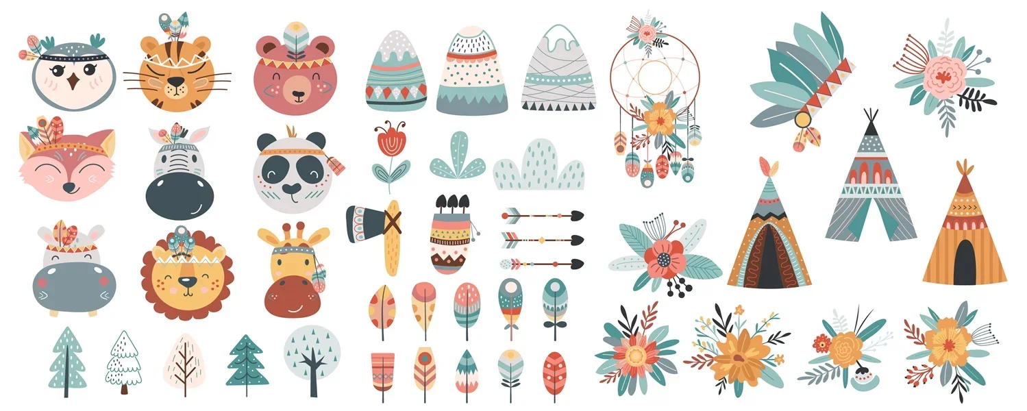
Global visual platforms have made design more accessible, but they have also encouraged stylistic sameness. One of the strongest responses in 2026 is a renewed interest in local references, regional color, vernacular typography, craft traditions and culturally specific storytelling. Designers are looking beyond universal visual formulas and creating work rooted in a place or community.
Cultural specificity can add depth to branding because it gives a visual system a source. Patterns, symbols and letterforms have histories and associations that can make a project more meaningful. However, using them responsibly requires research. A motif should not be selected only because it appears decorative or exotic. Designers need to understand its origin, context and possible significance.
Local flavor does not mean reproducing traditional styles without change. Contemporary design can reinterpret familiar forms through new grids, simplified vector shapes, modern color combinations or motion. The strongest results feel connected to heritage while still serving a current communication need.
This approach is effective for tourism, food, fashion, cultural institutions, place branding and international campaigns that need distinct regional versions. It also supports more authentic representation by allowing different audiences to see visual references that are relevant to them rather than receiving the same generic imagery everywhere.
Practical takeaway: Research the origin and meaning of visual references, then adapt them with respect instead of using culture as surface decoration.
Adaptive Identities and Responsive Logos
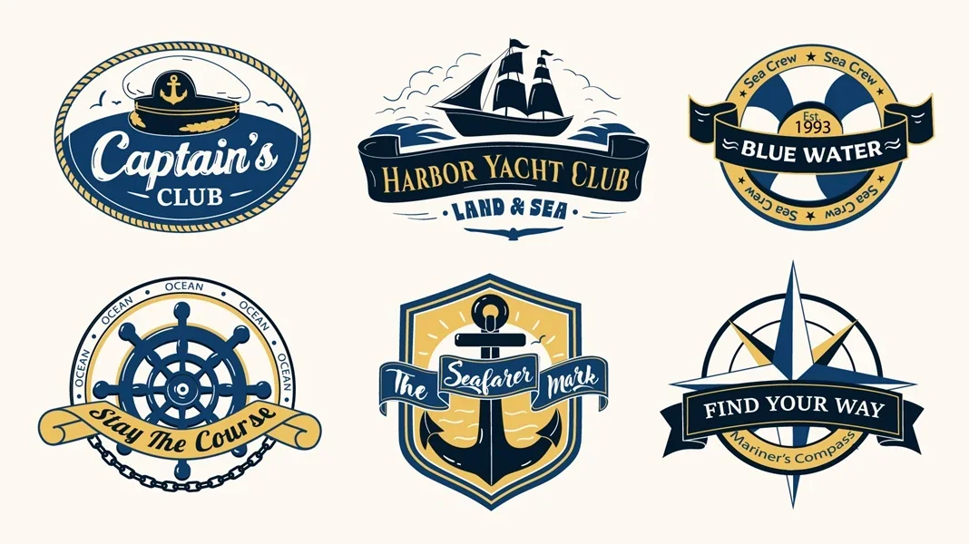
A modern identity can no longer depend on one fixed logo. Brands appear in app icons, social avatars, videos, packaging, websites, events and small interface components. In response, designers are building adaptive systems that change according to size, format and context while remaining recognizable.
A responsive logo may have several levels: a detailed primary mark, a simplified horizontal version, a compact symbol and a motion behavior. Color may also change across campaigns, or a logo may become a frame for photography, patterns and illustration. The identity is held together by repeated proportions, typography and visual rules rather than by a single unchanging arrangement.
Vector formats are essential here because they support reliable scaling and rapid variation. Designers can create modular components that work across print and digital media without rebuilding the artwork. A well-organized asset library also reduces inconsistency when multiple teams produce content.
Adaptability should not become constant novelty. If every version looks unrelated, recognition disappears. The system needs a stable core that survives every transformation. Testing should include very small sizes, monochrome use, motion, dark backgrounds and situations where the full brand name cannot appear.
Practical takeaway: Design the identity as a family of coordinated assets, with clear rules for what may change and what must remain consistent.
AI-Assisted, Human-Directed Design
Artificial intelligence is now part of many creative workflows, but the conversation is shifting from whether designers use AI to how they direct it. The most valuable applications are not necessarily finished image generation. Designers use AI to explore variations, organize references, test compositions, remove repetitive work and identify possible directions before refining the result manually.
This distinction matters because automated output often reflects common visual patterns. Without strong art direction, different projects can quickly begin to look alike. Human judgment is needed to select what fits the brief, reject visual clichés, verify details and build a coherent system across many assets. Originality increasingly comes from the decisions made after generation rather than from the first result.
Vector designers have a particular advantage because editable structure supports meaningful refinement. Paths can be simplified, proportions corrected, colors aligned with a brand and individual elements reorganized. The final artwork becomes more controlled, reusable and production-ready than an unedited output.
Responsible use also includes understanding licensing, documenting sources when necessary and being transparent about the production process. Different clients and marketplaces have different requirements. A professional workflow should protect both the creator and the customer while ensuring that the final design is accurate and suitable for its intended use.

Practical takeaway: Treat AI as an exploratory and production tool, while keeping concept, selection, refinement and accountability under human direction.
Motion and Storytelling Layouts
Graphic design is increasingly experienced over time rather than as a single static frame. Websites reveal information through scroll, logos respond to interaction and social graphics are created as short sequences. Motion is becoming part of the original design system, not an effect added after the layout is finished.
This shift changes how designers organize visual assets. An illustration may need separate layers so that characters, backgrounds and interface elements can move independently. Icons may require consistent stroke construction to animate cleanly. Typography must remain readable while changing position or scale. Planning these behaviors early produces more natural results.
Storytelling layouts also influence static work. Instead of placing every element inside a rigid grid, designers create a sequence of visual moments: an opening statement, a detailed explanation, a pause and a final action. Freeform arrangements can guide attention when hierarchy remains clear. The composition becomes a journey rather than a container.
Motion should always have a purpose. It can demonstrate change, reveal relationships, provide feedback or create emotional tone. Constant movement competes with content and may create accessibility problems. The best systems use animation selectively and provide a clear experience even when motion is reduced or unavailable.
Practical takeaway: Plan motion as part of the visual language and use it to explain, guide or emphasize—not merely to decorate.
How to Use the Graphic Design Trends of 2026
A trend becomes useful only when it supports a real communication goal. Designers do not need to apply all twelve styles, and combining too many of them can weaken a project. The first question should always be what the audience needs to understand or feel. The visual direction can then be selected according to that answer.
For a brand that needs trust and clarity, bold minimalism, editorial typography and warm illustration may be appropriate. A cultural campaign may benefit from local references, collage and expressive type. A digital product may use adaptive identity assets, dimensional icons and purposeful motion. The same trend can also be interpreted at different intensities. Maximalism might define an entire poster or appear only as a compact group of stickers inside an otherwise restrained layout.
It is equally important to build with reusable components. Color palettes, type scales, icon families, vector elements, textures and illustration rules should be documented so that the visual idea can extend across future content. A trend-led campaign may attract attention once, but a coherent system creates long-term value.
Finally, designers should test their choices in realistic conditions. A composition needs to work on the intended device, at the correct size and with actual text. Accessibility, loading performance, localization and production requirements can change which visual treatment is appropriate. Modern design is not only about appearance; it is about creating an experience that remains effective in use.
Final Thoughts
The graphic design trends of 2026 point toward a more expressive and flexible visual culture. Technology is expanding what designers can produce, while audiences are asking for stronger evidence of human intention. This is why imperfect marks, tactile textures, cultural detail and personal illustration are growing alongside AI-assisted workflows, adaptive identities and immersive digital tools.
The future is not purely minimal or maximal, flat or three-dimensional, automated or handmade. The strongest work combines approaches with purpose. It may use advanced tools while preserving a recognizable point of view. It may rely on a clear grid but allow one element to break it. It may begin with a reusable vector system and gain character through texture, motion or narrative detail.
For designers and brands, the opportunity is not to imitate every popular style. It is to understand why these styles are resonating and choose the principles that support a specific message. When trends are treated as tools rather than rules, they can help visual communication feel current without becoming temporary.
In 2026, successful design will be recognized not only by how polished it looks, but by how clearly it communicates, how naturally it adapts and how distinctly it reflects the people behind it.