Articles
Free Design Resources for Websites
Introduction
A polished website is rarely built from typography and layout alone. Visual assets give a page personality, explain ideas faster and guide visitors toward important actions. A well-placed illustration can make a hero section memorable, a consistent icon set can improve navigation, and a simple vector diagram can turn complicated information into something users understand at a glance. The challenge is not finding graphics—it is finding the right graphics and using them as part of one coherent visual system.
Free design resources for websites can help independent designers, developers, startups and small teams create professional work without stretching a limited budget. They are useful for early concepts, client presentations, minimum viable products, social campaigns and even finished commercial websites when the license permits it. However, downloading the first attractive asset you see often leads to mixed styles, weak hierarchy, poor technical performance or licensing problems.
This guide explains how to work with free illustrations, icons, vector elements, infographics, backgrounds, textures and UI graphics. It also covers file formats, visual consistency, accessibility, performance and licensing. The goal is not to fill every empty space with decoration. It is to choose assets that support the message, fit the interface and make the entire website feel intentionally designed.
Why Visual Resources Matter in Web Design
People scan webpages before they read them. Strong visuals create recognizable entry points, divide long pages into manageable sections and help visitors predict what will happen next. This matters on landing pages, where users must quickly understand a product, and in interfaces, where clarity can influence whether a task feels simple or frustrating.
Visual resources also improve communication. A service illustration can present an abstract benefit, icons can label features without repeating long phrases, and diagrams can show relationships that would require several paragraphs of explanation. When these assets follow the same colors, proportions and level of detail, they reinforce the brand rather than competing with it.
The most useful graphics have a job. Before adding an asset, ask whether it explains, directs, reassures, organizes or establishes mood. Decorative elements are not forbidden, but they should not distract from the content or primary call to action. This purpose-first approach keeps a website visually interesting without making it noisy.
Free Vector Illustrations for Modern Websites
Illustrations are especially effective when photography cannot represent a concept clearly. They can visualize digital services, teamwork, analytics, security, education, healthcare, ecommerce and other ideas that are difficult to photograph without becoming generic. Because an illustration can simplify reality, it lets a designer emphasize the exact message a section needs.
On a homepage, use a strong illustration to establish the tone and support the main value proposition. On inner pages, smaller scenes can introduce features, onboarding steps, empty states or help content. Illustrations also work well in blog headers and marketing campaigns, where a recognizable visual style can connect separate pieces of content to the same brand.
For the best result, choose artwork with enough negative space for the surrounding layout. Check whether the composition still works at the size required by the page. Highly detailed scenes may look impressive in a large preview but become unreadable on mobile screens. Simpler shapes, clear silhouettes and controlled contrast usually scale more reliably.
Designers who need adaptable artwork can begin with free vector graphics. Editable vector files make it easier to adjust colors, remove unnecessary objects and bring each illustration closer to the website’s visual identity. Keep the original proportions unless the composition is deliberately being rebuilt, and test the result on both light and dark backgrounds.

Free download: Teamwork concept illustrations
Free Icons for Websites and Interfaces
Icons are small, but they carry a large amount of interface responsibility. They identify actions, support navigation, summarize benefits and make repeated information easier to scan. A familiar search, download or account symbol can communicate faster than text, while a more descriptive icon can help distinguish services or product categories.
Consistency matters more than novelty. Icons used together should share the same stroke weight, corner treatment, perspective, bounding box and optical size. Mixing thin outline icons with heavy filled symbols makes an interface look assembled from unrelated parts. Even when every individual icon is attractive, the collection can feel unprofessional if its visual rules change from one item to another.
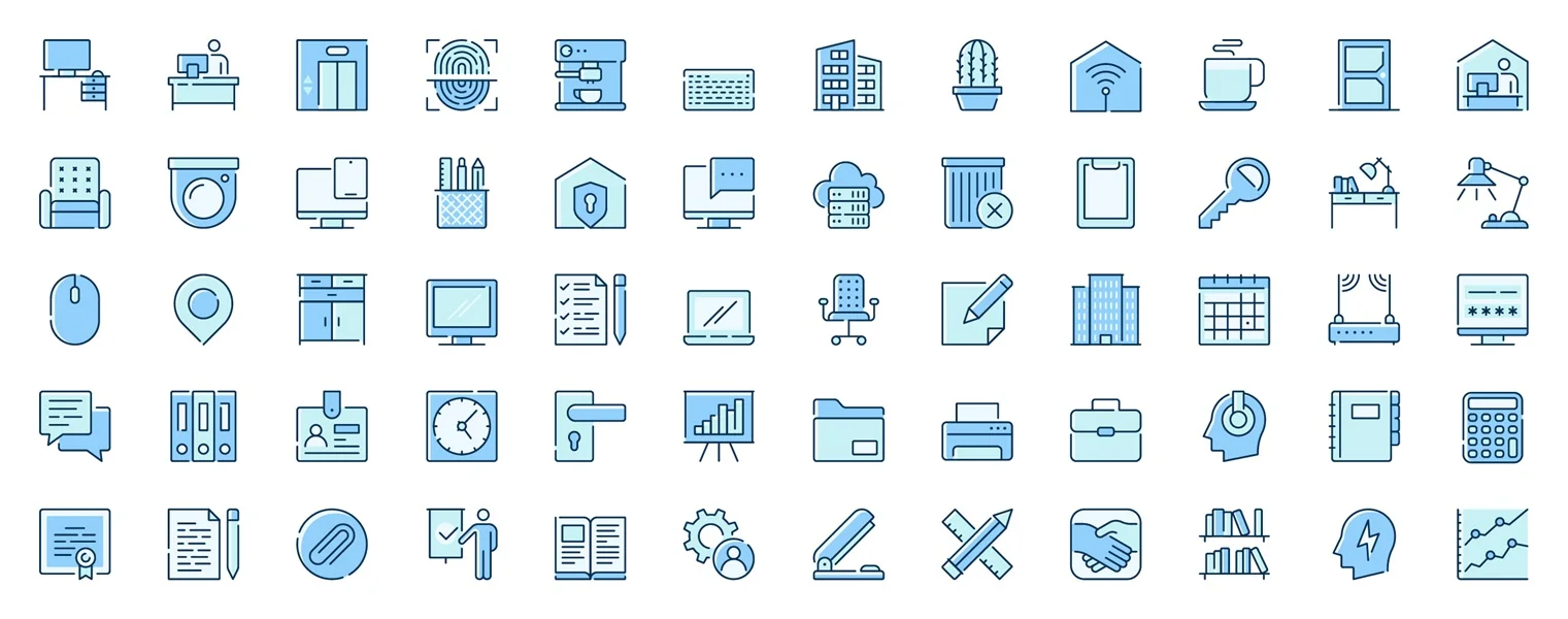
Free download: Office workspace web icons pack
Use icons as support rather than as puzzles. Common interface actions should remain familiar, and less obvious symbols should appear with a text label. Avoid making essential controls depend only on color or ambiguous imagery. Buttons and navigation items also need adequate contrast, clickable area and spacing, especially on mobile devices.
SVG is generally the most flexible format for web icons because it stays sharp at any resolution and can often be styled with CSS. Before publishing, remove unnecessary metadata, confirm that strokes scale correctly and make sure the viewBox does not add unexpected empty space. PNG remains useful when a graphic includes raster effects or must be delivered as a fixed image.
Vector Elements for Landing Pages and Campaigns
Not every visual needs to be a complete illustration. Arrows, badges, labels, abstract shapes, stickers, ribbons, frames and decorative marks can create emphasis and rhythm throughout a page. These smaller vector elements are valuable for promotions, feature highlights, pricing sections, seasonal campaigns and editorial layouts.
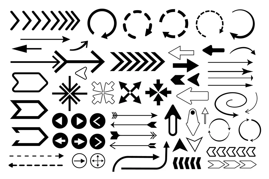
Free download: Arrows set in flat graphic design
The key is restraint. Choose a limited family of shapes and repeat it with purpose. A hand-drawn arrow can direct attention to a button; a subtle geometric pattern can support a section background; a badge can highlight a new feature. If every section uses a different motif, the page loses its hierarchy and the decorative system becomes the main event.
Because vectors are editable, one asset pack can generate multiple variations. Recoloring a small set of elements with the brand palette is usually more effective than collecting many unrelated packs. Keep stroke widths and shadow styles consistent, and avoid stretching decorative graphics in ways that distort their visual character.
Infographic Elements for Explaining Data
Websites often need to communicate numbers, processes and comparisons. Infographic elements — charts, labeled steps, percentage indicators, diagrams and data callouts — can turn raw information into a clear story. They are useful on annual reports, product pages, case studies, presentations and long-form articles.
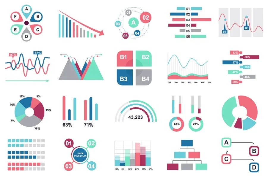
Free download: Infographic Design Elements
Start with the information rather than the template. Decide what users should learn, then choose the simplest visual form that reveals that relationship. A bar chart works well for comparison, a line chart for change over time and a compact process diagram for a sequence of actions. Decorative charts that do not accurately represent the values can weaken trust.
Use color to group and highlight, not simply to make every element different. Labels should remain readable at mobile widths, and important values should also exist as text so screen readers and search engines can access the information. When a chart becomes too dense for a small screen, consider showing a simplified version or allowing users to open a larger view.
Backgrounds and Textures Without Visual Clutter
Backgrounds influence the mood of a page before users consciously notice them. Soft gradients can add depth to a modern interface, geometric patterns can introduce structure, and paper or grain textures can make an editorial design feel more tactile. Used carefully, these assets can separate sections and support a brand atmosphere.
The background must remain subordinate to the content. Reduce contrast behind body text, preserve generous empty areas and test legibility on different displays. A texture that looks subtle on a large monitor may create noise or compression artifacts on a phone. Overly detailed image backgrounds can also increase page weight and make buttons or links harder to recognize.
Whenever possible, use CSS gradients, small repeating patterns or optimized SVG backgrounds. Raster textures should be compressed and exported close to their actual display dimensions. Avoid uploading a huge print-resolution image when the website only needs a narrow section background.
UI Graphics, Objects and Supporting Assets
Interface design sometimes needs more than standard icons. Device mockups, browser windows, dashboard components, maps, product objects and empty-state graphics can help demonstrate a service or add context to a workflow. These supporting assets are particularly useful for SaaS pages, app presentations and onboarding screens.
Treat predesigned UI graphics as a starting point, not a replacement for a design system. Update typography, color, radius, spacing and component states so the graphic matches the real product. If a dashboard illustration shows a fictional interface, avoid making it look like an interactive control unless users can actually click it.
A consistent asset library speeds up production because the team does not need to redraw every supporting object. It also helps blog posts, product pages and social graphics feel connected. A smaller, well-managed library usually produces stronger results than a large folder of assets with no shared style.
How to Build a Consistent Visual System
Consistency does not mean every graphic must be identical. It means the assets should appear to belong to the same world. Begin with a short set of visual rules: primary and supporting colors, outline weight, corner style, shadow treatment, perspective and level of detail. These decisions make it easier to evaluate a new asset before it enters the project.
Limit the number of illustration styles on a single website. If the hero uses soft flat characters, avoid switching to glossy 3D objects in the next section without a clear reason. The same principle applies to icons and diagrams. Small adjustments to palette and stroke can help, but some styles are fundamentally incompatible and should not be forced together.
Create reusable export sizes and naming conventions. Organize assets by type and usage, keep editable source files separate from optimized web versions and document any license requirements. This simple workflow reduces duplicate downloads and prevents team members from using outdated or unapproved graphics.
A curated collection of website design assets can make this process easier because related illustrations, icons and vector elements can be evaluated in one place. Select a small group that shares visual characteristics, then customize it around the brand instead of introducing a new style on every page.
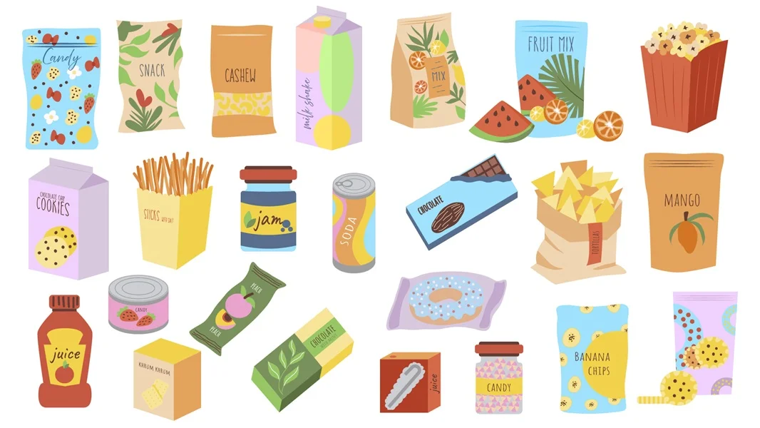
Free download: Snack products graphic elements
Performance, Responsive Design and Accessibility
A beautiful asset can still damage the user experience if it loads slowly or breaks the layout. Export graphics at appropriate dimensions, compress raster files and optimize SVG markup. Use responsive image techniques when several raster sizes are available, and lazy-load noncritical visuals below the first screen. The most important hero content should not wait behind oversized decoration.
Test every asset at realistic breakpoints. A wide composition may need a different crop on mobile, while an icon row may need to wrap into two columns. Do not shrink detailed text inside an illustration until it becomes unreadable. When information is essential, present it as real HTML text rather than baking it permanently into an image.
Accessibility should be planned according to purpose. Informative images need concise alternative text that communicates their meaning. Purely decorative graphics should usually be hidden from assistive technology so they do not create unnecessary noise. Maintain sufficient contrast and never rely on color alone to distinguish important states or data categories.
Animation requires the same discipline. Movement can demonstrate a process or draw attention to feedback, but constant decorative motion may distract users and affect performance. Respect reduced-motion preferences and ensure the page remains understandable when animation is disabled.
Check the License Before You Publish
The word free describes price, not necessarily permission. Every resource comes with license terms that define where it can be used, whether attribution is required and whether commercial projects are allowed. Some assets are free only for personal work. Others permit commercial use but prohibit redistribution, resale or inclusion in a competing asset library.
Read the license on the original download page and keep a copy with the source file. Confirm whether you may modify the asset, use it in client work, include it in a template or display it in an advertisement. If the design contains recognizable trademarks, products or people, additional restrictions may apply even when the graphic file itself has a broad license.
Do not redistribute a downloadable source file as your own product. When an asset is used in a website or final design, it should be integrated into a larger composition rather than offered in a way that lets other users extract and resell it. If the terms are unclear, contact the creator or choose another resource with transparent conditions.
A Practical Workflow for Using Free Assets
1. Define the communication goal
Write down what the page must explain and what action visitors should take. This prevents decorative choices from leading the design.
2. Establish visual rules
Choose a palette, illustration approach, icon style and level of detail before downloading multiple packs.
3. Select a focused asset group
Collect only the resources needed for the page. Compare them at the actual display size rather than judging large previews.
4. Customize with purpose
Adjust colors, proportions and unnecessary details while preserving the original quality and recognizability of each asset.
5. Optimize for delivery
Export appropriate SVG, PNG or JPG versions, compress files and use clear filenames.
6. Test in context
Review desktop and mobile layouts, loading behavior, contrast, alternative text and the relationship between visuals and calls to action.
7. Record the license
Save the source URL, creator information, license text and attribution requirements alongside the editable file.
Common Mistakes to Avoid
The most common problem is collecting assets individually without checking how they work together. A website can contain high-quality graphics and still feel inconsistent because the line weights, palettes and perspectives conflict. Build a visual family, not a gallery of unrelated favorites.
Another mistake is using illustration as a substitute for clear content. A graphic can support a headline, but it cannot rescue a vague value proposition or confusing navigation. Begin with message and hierarchy, then choose visuals that make them easier to understand.
Avoid excessive detail and oversized files. Decorative artwork should not delay meaningful content, and tiny interface icons should not contain complexity that disappears at 24 pixels. Finally, never assume that a resource is approved for commercial use simply because the download button says free.
Where to Find Free Design Resources for Websites
A useful resource library should make assets easy to preview, categorize and download in practical formats. Look for clear licensing information, consistent previews and editable vector files when customization matters. Search by the role an asset will play—hero illustration, feature icon, background, diagram or interface object—rather than collecting graphics without a planned use.
Quality is more valuable than volume. Ten compatible assets can support an entire landing page and campaign, while hundreds of mismatched downloads often remain unused. Favor collections that help you maintain a recognizable style across web pages, presentations, blog graphics and social content.
For a starting point, explore these free design resources and choose a compact set that suits the project’s audience, tone and technical requirements. Review the available formats and license, then adapt the selected graphics into a consistent system rather than publishing every asset exactly as downloaded.
Final Thoughts
Free illustrations, icons, vector elements, infographics, backgrounds and UI graphics can significantly improve a website when they are chosen with intention. They help communicate ideas, strengthen hierarchy, create personality and reduce the time required to build supporting visuals from scratch.
The strongest results come from treating these resources as components of a design system. Choose assets for a clear purpose, maintain consistent visual rules, use suitable file formats, optimize performance, support accessibility and verify the license before publishing. With that discipline, free design resources can support work that feels original, coherent and professionally finished.