Articles
How to Create a Consistent Icon Set
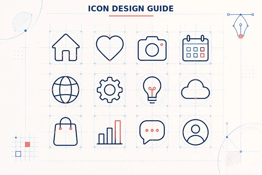
The short version: establish your rules before drawing the first icon. A grid, stroke system, corner treatment and visual-weight checks turn separate symbols into one recognisable family.
Why icon consistency matters
A great icon set does more than look neat. It makes an interface easier to scan, helps users recognise recurring actions and gives a product or brand a distinct visual voice. The opposite is immediately noticeable: one icon feels too heavy, another is too small inside its frame, and a third uses completely different curves. Even when users cannot name the problem, the whole interface starts to feel less reliable.
Looking closely at well-built SVG icons is one of the quickest ways to train your eye for repeated decisions in scale, spacing and stroke treatment.
Consistency is not the same as copying the exact same shape again and again. Each symbol needs to communicate a different idea, yet all of them should appear to have been drawn by the same designer using the same set of decisions. This is what an icon system does: it gives every new symbol a shared visual grammar.
1. Start with a system, not a collection
Before opening Illustrator, define a short set of rules. Think of it as a mini style guide for your future self. This first step is faster than repairing twenty completed icons later.
• Choose the base canvas: 24 x 24 px is common for interface icons, while 48 x 48 px gives more room for detailed line work.
• Set a safe area inside the canvas. Most icon families need visible breathing room around the outer shape.
• Decide whether the set is outline, filled, duotone or mixed. Avoid switching styles without a deliberate reason.
• Set one primary stroke weight, line cap style and line join style before drawing.
• Define a limited corner-radius system: for example, fully round, slightly rounded or sharp.
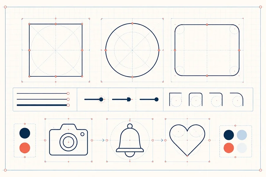
Use a small starter sheet with a square, circle, horizontal rectangle and vertical rectangle. These key shapes help you judge how much of the canvas each icon should occupy. A shopping bag, a cloud and a light bulb should not have the same geometry, but they should feel equally present.
2. Build on a grid and key shapes
A grid is not there to make every icon mathematically identical. It gives you repeatable limits for placement, proportions and empty space. Start with a simple grid: a central vertical axis, a central horizontal axis and a safe area around the edges. Then add key circles and rectangles that define the typical footprint of your symbols.
For example, a circular symbol such as a globe will naturally fill more of its bounding area than a narrow symbol such as a bookmark. If you force both to use the same physical width and height, the bookmark will feel timid. Instead, align their perceived mass: let the bookmark become taller or slightly wider until it reads with comparable confidence.
A practical grid check
• Place every icon on the same artboard size.
• Toggle the grid off and compare the silhouettes at 100% scale.
• Check whether circular, triangular and rectangular icons appear equally large.
• Look for accidental tangencies: strokes almost touching the safe area or inner details crowding the outer contour.
3. Keep stroke weight truly consistent
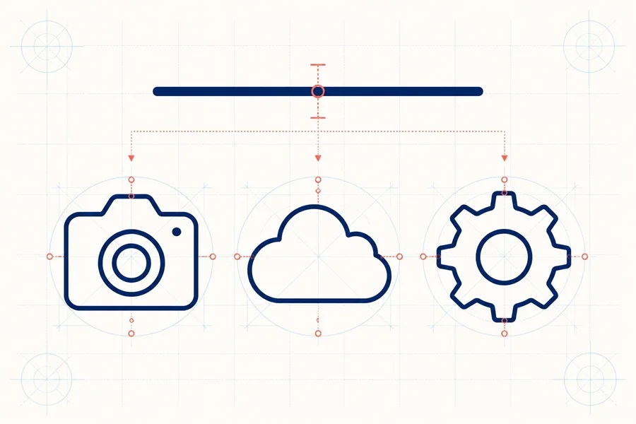
Stroke width is the fastest way to make an icon set look related. Pick one primary value and use it for the outer contour and most internal details. For a 24 px outline system, a 2 px stroke is a familiar starting point, but the right number depends on the personality of the set and the size at which it will be used.
Do not judge stroke weight while zoomed in at 800%. Test the icons at their real interface size. At small sizes, a thin inner line can vanish and a dense detail can turn into noise. It is acceptable to make a small optical adjustment when an icon genuinely needs it, but that should be the exception, not a different rule for every symbol.
• Use the same cap: round caps feel friendly and soft; butt caps feel more technical.
• Use the same join: round joins, bevel joins and miter joins communicate different personalities.
• Keep the relationship between outer and inner strokes consistent across the set.
• Convert or expand strokes only at the final export stage if the target format requires it.
4. Use optical balance, not only measurements
Perfectly equal measurements do not always look equal. A circle can look larger than a square with the same dimensions. A diagonal shape often feels lighter than a vertical one. A tiny handle on a bag can make the whole icon appear top-heavy. These differences are normal, which is why the final stage of icon design is optical correction.
Make controlled adjustments after the basic geometry is correct. Enlarge a small-looking symbol by a fraction, move a visual centre slightly upward, or reduce a heavy corner. The goal is not to break the grid. The goal is to make the finished set look calm and balanced when seen as a group.
Three useful comparison views
• Thumbnail view: reduce the whole set and check whether each idea is still recognisable.
• Monochrome view: remove colour to reveal differences in weight and silhouette.
• Row view: place all icons in one horizontal line to expose uneven scale or spacing.
5. Simplify the metaphor before adding detail
A good icon is a short visual sentence. If it needs many tiny components to explain itself, simplify the underlying metaphor. Start by asking what the user needs to understand in one second. A calendar needs a recognisable page and date structure; it does not need every binding ring or every square in a real monthly grid.
Choose one visual idea per icon. If an icon combines a cloud, arrows, a lock and a database, it is no longer a quick symbol. Save richer explanations for illustrations, tooltips or labels. In interfaces, clarity survives small sizes better than decoration.
6. Test icons in their real context
A polished artboard is not the final test. Icons behave differently inside buttons, navigation bars, cards and mobile controls. Place a few of your symbols beside realistic labels, try light and dark backgrounds, and preview them at several sizes. Also check whether their touch targets remain comfortably larger than the visible symbol on mobile.
This is where a flexible vector workflow helps. Export SVG for scalable interface use, then create PNG previews at the sizes designers and developers actually need. If you are building downloadable assets, offer a clear structure and a consistent naming system so people can immediately find the correct file.
For a practical reference, explore this Office Supplies Line Icon Set. It is a useful example of how familiar objects can stay visually aligned when they share the same grid, stroke and corner rules.
A fast consistency checklist
• Every icon uses the same canvas size and safe area.
• Primary stroke width, caps and joins follow one rule.
• Corner radii match the style of the set.
• Icons have comparable visual weight, not merely identical bounding boxes.
• Small details remain readable at the intended size.
• The set looks balanced in monochrome and in one row, and its SVG files are clearly named and tested after export.
Build the family, then grow it
The strongest icon libraries are not made in one sitting. Start with a small core set of the most common concepts, make the system reliable, and then add new icons using the same rules. When the visual grammar is documented, future work becomes faster and the collection stays coherent even as it grows.
For more ready-to-use symbols and collections, explore a vector icon packs on VectorElements. A carefully built set saves time, keeps interfaces consistent and gives designers more freedom to focus on the larger visual story.