Articles
How to Use Texture in Graphic Design
A practical guide to adding depth, character and visual interest without overwhelming the design.
Texture is one of the simplest ways to make a clean design feel more tactile, memorable and finished. It can add warmth to a brand identity, give a poster an editorial feel or help a social media graphic stand out in a crowded feed. The key is not to add texture everywhere - it is to use it with a clear purpose.
What Is Texture in Graphic Design?
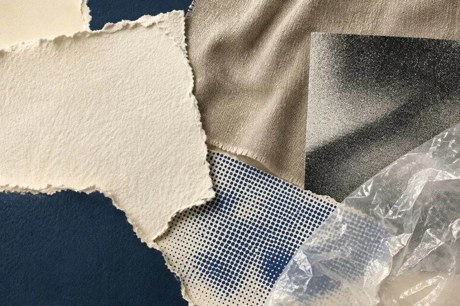
In graphic design, texture is a visual surface quality that suggests a material, print process or atmosphere. It may look like paper grain, fabric, dust, ink, film, plastic, halftone dots texture or subtle noise. Even on a flat screen, these details can make an image feel more physical and less generic.
Texture can be created by hand, photographed from real materials or added with digital overlays. It works especially well when a design feels too smooth, empty or overly digital.
Why Designers Use Texture
• Add depth and make flat colors or simple shapes feel more dimensional.
• Create mood: soft paper can feel calm and handmade, while grain or halftone can feel bold and energetic.
• Support a visual style, such as vintage print, retro punk, minimal editorial or natural craft.
• Create hierarchy by making the background quieter than the main message or focal element.
Popular Types of Design Textures
Paper and Fabric
Best for branding, packaging, invitations and calm editorial layouts.
Grain and Noise
Useful for backgrounds, gradients, modern posters and digital artwork.
Halftone and Print
A strong choice for retro designs, music artwork, streetwear and bold campaigns.
Film, Plastic and Scan Effects
Suitable for photography, social posts and experimental typography.
Five Easy Ways to Use Texture
1. Add a subtle background layer
A low-opacity paper, grain or fabric texture can prevent a plain background from looking empty. Keep contrast low so text remains easy to read.
2. Give typography more personality
Place a texture inside large display text or behind a headline. A rough halftone can make a title feel louder, while soft paper can make it feel more refined.
3. Use texture to build a mood
Choose the texture according to the feeling you want to create. Soft paper and fabric can feel warm and handmade, while grain, scan marks and halftone can give a layout a more energetic or nostalgic character.
4. Build contrast between clean and imperfect
Combine clean typography and generous empty space with an imperfect surface such as folded paper, ink grain or a scanned film overlay.
5. Use texture to unify a series
For a carousel, campaign or collection of posts, use one texture family throughout. Repeating the same grain level, paper texture or halftone treatment helps separate pieces feel like one visual system.
How to Avoid Common Mistakes
• Do not place a high-contrast texture behind small text.
• Avoid combining too many texture styles in one layout.
• Use scale deliberately: a fine grain and a large paper fold create very different moods.
• Check the final design on mobile, where subtle detail can disappear or become visual noise.
• Keep the main message or focal element clear and easy to notice.
A Simple Starting Formula
Start with a clean layout, one strong focal point and one texture layer. Set the texture to a low opacity, then increase it only until it adds character. If the viewer notices the texture before the message, it is probably too strong.
Find the Right Texture for Your Project
Choose paper and fabric textures for warm, tactile work; grain and noise for modern digital visuals; halftone for bold printed energy; and film or plastic overlays for more experimental compositions. A carefully chosen texture can turn a simple layout into a design with atmosphere and a recognizable point of view.