Articles
How to Create Retro Printed Photo Effect in Photoshop
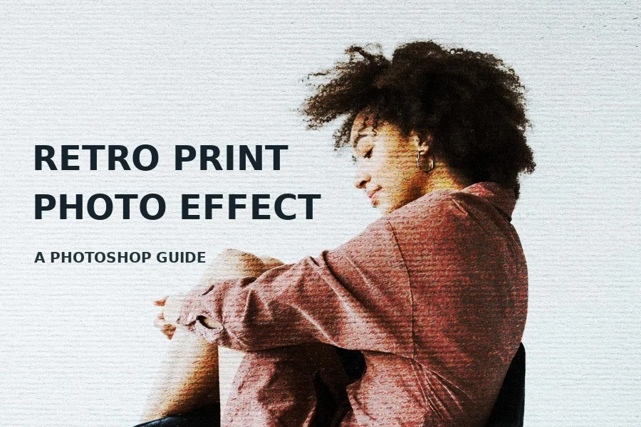
A practical guide to color, worn ink, paper texture and grain using one portrait from start to finish.
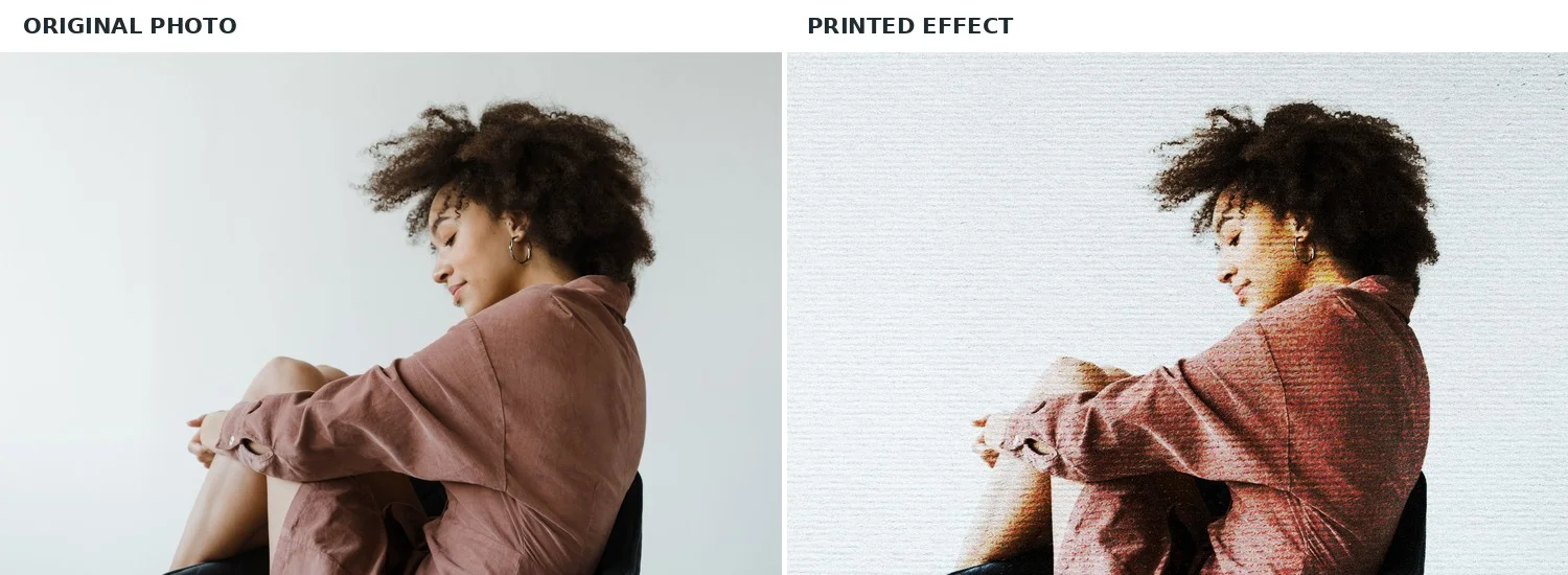
A retro print treatment can give a clean photograph the character of a page that has been printed, handled and scanned. The effect in this guide combines a warm color shift with irregular ink marks, visible paper and fine noise. Each image below shows the same portrait at a different stage of applying the Photoshop effects, so you can see exactly what each step contributes. The process works especially well for editorial portraits, posters, album art and social graphics.
Understand the Look Before You Start
This style depends on the relationship between photograph and surface. The portrait provides shape and emotion the color adjustments establish an ink-like palette the distressed texture interrupts smooth areas the paper supplies a physical surface and the final noise ties those layers together. These are separate decisions. If you push every setting to its maximum, the face and clothing lose useful detail.
The example uses broken, streaked ink and fine grain rather than a regular halftone dot pattern. Keep that distinction in mind when selecting textures. A clean dotted screen would produce a different visual language.
Choose and Prepare Your Photo
Start with an image that has a recognizable silhouette, useful contrast and enough resolution for the intended output. The portrait here has dark hair against a light background and visible folds in the clothing. Those areas respond differently to the ink texture, which makes the result easy to read. The source photo is 2048 × 1366 pixels the supplied PSD is 4500 × 3000 pixels. A larger Photoshop canvas can hold the image, but enlarging a small source does not create missing detail. For a large print, begin with a higher resolution photograph.
Open the photograph in Photoshop, crop to your final composition and keep an untouched copy. Convert the image to a Smart Object before adding adjustment layers. This lets you change the picture later while preserving the rest of the effect. If you are working with the ready-made PSD, the Image layer inside the Effect group is already a Smart Object.
Step 1 Build the Tonal Foundation
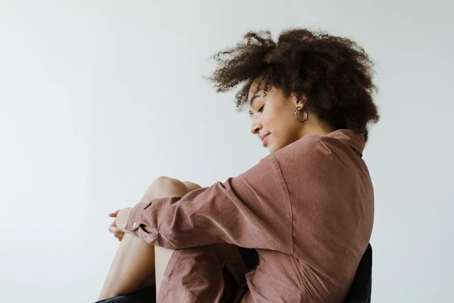
Use a Levels adjustment layer to establish a clean light background and strong dark shapes. Bring the white input toward the beginning of the occupied highlights only as far as the subject can tolerate. Move the black point until the hair and chair feel solid, then inspect the midtone slider for the face and fabric. The purpose is to define areas that will later accept broken ink, not to flatten the photograph into pure black and white.
Follow with a gentle Curves adjustment. A modest S-shaped curve can deepen shadows and give the highlights more separation. Watch the skin closely: it should still have transitions, even if the image will become rougher in the next step. In the supplied file, the Levels and Curves layers are separate, and the Curves layer is blended at roughly half opacity. That is a useful reminder that a strong curve can often be improved by reducing its layer opacity.
Step 2 Introduce a Warm Print Palette
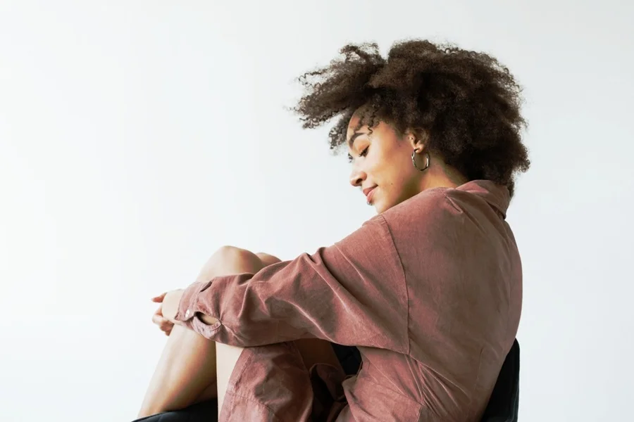
Add a Color Lookup adjustment above the photo and judge it together with the tonal adjustments. The supplied PSD contains a FallColors lookup, which warms the skin and clothing while allowing deep shadows to remain dark. If that lookup is unavailable in your Photoshop installation, use a Gradient Map or Color Balance adjustment to create a similar limited palette: warm highlights, reddish midtones and restrained near-black shadows. Work from the visible result rather than trying to match a preset name.
A useful check is the empty part of the background. It should still read as a light page. If the color treatment turns it visibly gray or saturated, reduce the adjustment opacity or lift the highlight point. The palette gives the print its mood the paper layer will add the physical surface later.
Step 3 Add Worn Ink
Place an irregular print texture above the image. Look for broken horizontal marks, small gaps and uneven coverage rather than a uniform noise pattern. In the supplied project, a texture Smart Object in the Effect group uses Hard Mix at about 30% opacity. At full strength Hard Mix can be severe, so its reduced opacity is essential to the result. The texture cuts through smooth color and gives the shirt, hair and skin a dry printed character.
Scale the texture to the entire composition, then zoom to 100%. On the shirt, the marks should be visible on the face, they should suggest imperfect ink without hiding the eyes, nose and mouth. If needed, add a mask to the texture and paint softly with black where important facial features require more clarity. You can also lower the texture opacity or try a softer blend mode for another photograph. Avoid assuming that one setting will suit every source image.
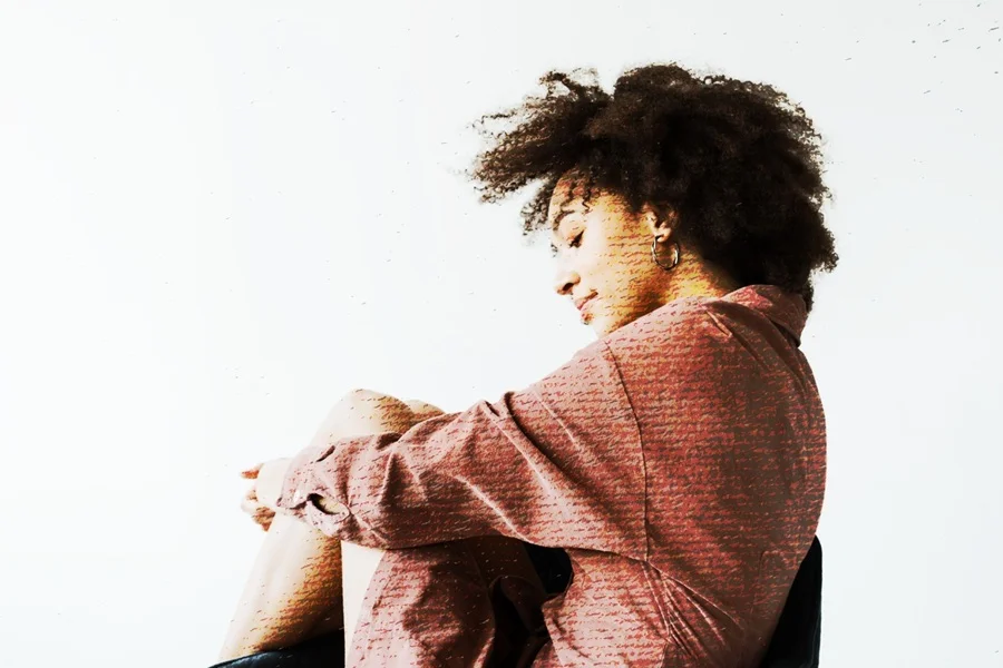
Step 4 Make the Paper Visible
Add a high-resolution paper texture across the canvas. The paper layer in this PSD is in the Adjustments group, uses Multiply and sits at roughly 36% opacity. Multiply brings darker fibers and surface irregularities into the photograph opacity keeps the white regions light enough to function as negative space. On a different paper image, the same opacity may be too strong, so adjust by eye.
The paper should appear in the open background and through the subject, linking them into a single printed sheet. If the page takes on a muddy cast, brighten the texture or lower its opacity. If the background looks digital and empty, raise the paper slightly. Compare the result at full size and at the small size where a reader will see it on a phone.
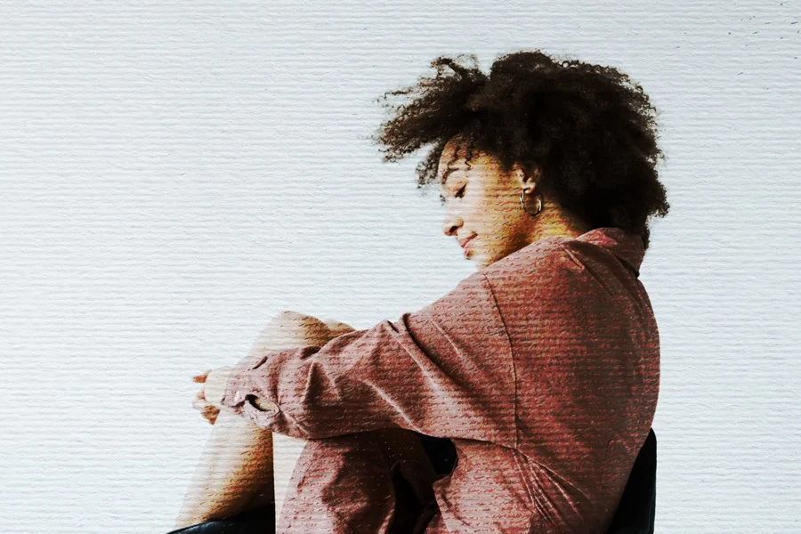
Step 5 Finish with Grain and Contrast
A final noise layer can unify the crisp source photograph, distressed ink and paper texture. The supplied file includes a layer named noize set to Vivid Light. This layer adds fine variation across the frame. If you are building the effect manually, a practical starting point is a 50% gray layer with a small amount of monochromatic noise choose a blend mode and opacity that add texture without creating colored specks or obscuring the paper. Inspect the print at 100% before exporting because grain that seems subtle at fit-to-screen size can become harsh in the final file.
The project also contains a Brightness/Contrast adjustment. Use it at the end to keep the figure readable against the page. The objective is a clear subject with intentionally imperfect detail, not a uniformly dark or uniformly noisy photograph.
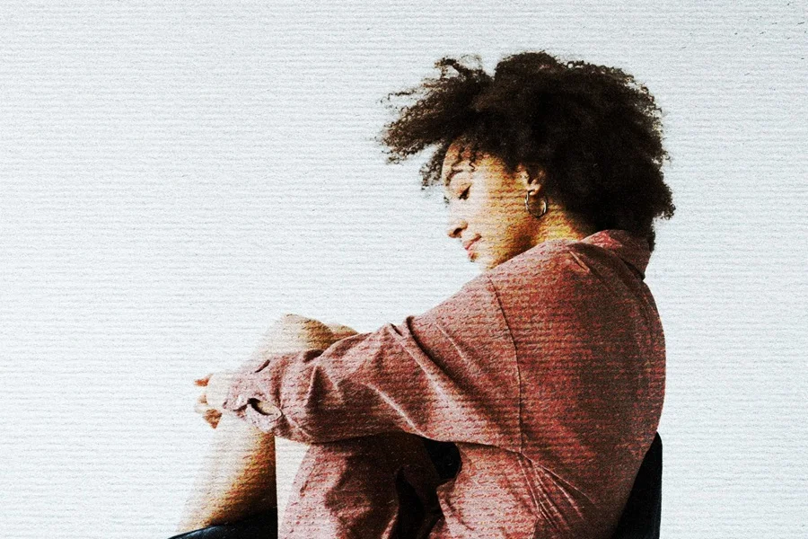
Apply the Effect with the Supplied PSD
If you want this treatment without rebuilding every layer, open the Retro Printed Photo Effect PSD and expand the Effect group in the Layers panel. Double-click the thumbnail of the Image Smart Object. Photoshop opens its embedded content as a separate document. Place your photograph into that document, fit it to the canvas and save it with Ctrl+S on Windows or Command+S on macOS. Close the embedded document and return to the main PSD, the effect should update with your photograph.
Keep the original PSD as a master copy. In the working copy, adjust the opacity of the upper ink texture, the lower paper texture and the final noise layer one at a time. The file also contains a hidden Edit Conent layer connected to the same embedded image edit the visible Image Smart Object in the Effect group and leave that hidden layer alone unless you know why you need it. Photoshop Smart Objects update the main composition when you save their contents.
If your new photo extends beyond the canvas, crop or scale it inside the Smart Object before saving. If it has a dark background, expect the paper and ink to behave differently from this light-background portrait. A believable print effect is an interaction between a particular image and particular textures, not a universal preset.
Adjust the Treatment for Different Images
For a portrait with delicate skin tones, start by reducing Hard Mix texture and preserving midtone detail in Levels. For an architectural image, stronger streaks may be acceptable because the subject has hard edges. On a dark scene, lift the background before adding paper so the sheet remains visible. On colorful artwork, test whether the lookup helps or whether a more restrained palette gives the print a clearer hierarchy.
Use the texture scale deliberately. Very small marks can look like digital compression oversized marks may resemble scratches rather than ink. The irregular lines in this example cross the clothing at a scale large enough to be seen in a web preview. Keep the important part of the photograph away from dense texture clusters. A mask gives you precise control without weakening the surface everywhere.
For a broader look at how texture affects composition, see How to Use Texture in Graphic Design.
Export and Review the Final Image
Save the layered PSD first. For a web article, export an sRGB JPEG or PNG at the actual display size and compare it with the Photoshop canvas. JPEG is suitable for a photographic image without transparency PNG may be preferable when preserving sharp graphics or text is more important than file size. Check three things after export: facial details, paper color and texture scale. Overcompression can turn subtle grain into unpleasant blocks, while excessive sharpening can make the distressed edges look brittle.
Common Problems and Quick Fixes
The face disappears. Lower the ink texture opacity, adjust its mask around the eyes and nose, or restore some midtone detail with Curves.
The background looks dirty. Reduce the paper opacity or lighten the paper texture before applying Multiply.
The colors become too red. Reduce the Color Lookup opacity or use a less saturated warm palette.
The grain looks like a filter. Use finer monochromatic noise, view it at 100% and lower its strength.
The new photo does not update. Save the embedded Smart Object document, then return to the main PSD and allow Photoshop to refresh the preview.
Questions Designers Often Ask
Do I Need a Halftone Filter
No. This example gets its look from broken ink, rough surface marks, warm color and paper grain. A Color Halftone filter produces regular dots and would change the character of the result. You can make a separate dotted version for a comic or newsprint project, but leave it out if you want the same worn, streaked finish shown here.
Can I Change the Photograph Later
Yes. Because the photo is an embedded Smart Object, you can reopen its contents, replace the photograph and save the embedded document. Keep the texture and adjustment layers in the main PSD. Check the crop and the strength of the tonal adjustments again after replacing the image a new photograph rarely has identical light and shadow values.
Can I Use This for a Vertical Poster
You can, but the supplied document has a horizontal 3:2 canvas. Make a vertical document, place the treated result or transfer the layer stack, and recheck every texture at the new size. A wide paper image stretched into a narrow layout may make the grain look unnatural. For print, confirm the final pixel dimensions and the printer’s required color profile before delivery.
Final Thoughts
The best retro print treatment lets a photograph stay recognizable while changing the way its surface feels. Build the look in passes: tone, warm color, worn ink, paper and grain. Compare each pass with the original so you can tell whether it contributes to the picture. Once the balance is right, save the layered master and export only the size you need for the final design.