Articles
How to Create Vector Halftone Effects in Adobe Illustrator
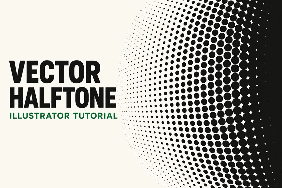
A halftone turns a smooth change in tone into a pattern of dots. In this tutorial, you will build that pattern from a black and white gradient in Adobe Illustrator, apply the Color Halftone effect, and trace the result into vector paths. The screenshots show every stage, including the point where the artwork is still a raster image and the step that finally makes it vector.
Before You Begin
Open a new Illustrator document and create a large rectangle on the artboard. The example uses an RGB document, a white to black fill, and a dot radius of 32 pixels. Keep a duplicate of the original gradient on a separate layer if you want to experiment later: the appearance and trace steps will no longer leave the original gradient available for easy adjustment.
Step 1 Create a Black and White Gradient
Select the rectangle, remove its stroke, and apply a linear gradient from white on the left to black on the right. Use the Gradient tool or the Gradient controls in the Properties panel to drag across the shape and position the transition.
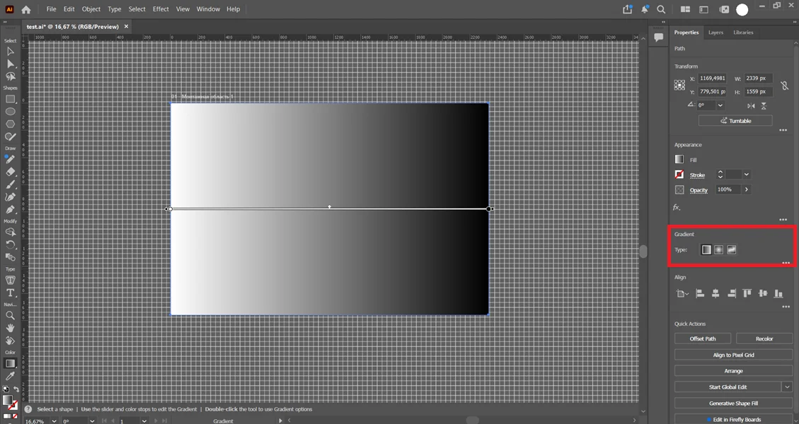
The light end will produce tiny black dots or open white space. Dots grow as the fill becomes darker, and the deepest shadows can merge into a nearly solid area. You can change the gradient later to redesign where these regions fall first, finish the basic version shown here.
Step 2 Apply the Color Halftone Effect
With the gradient rectangle selected, open Effect > Photoshop Effects > Pixelate > Color Halftone. The submenu labeled Pixelate in the screenshot is the one to use. Illustrator may also list Color Halftone near the top of the Effect menu if you applied it recently.
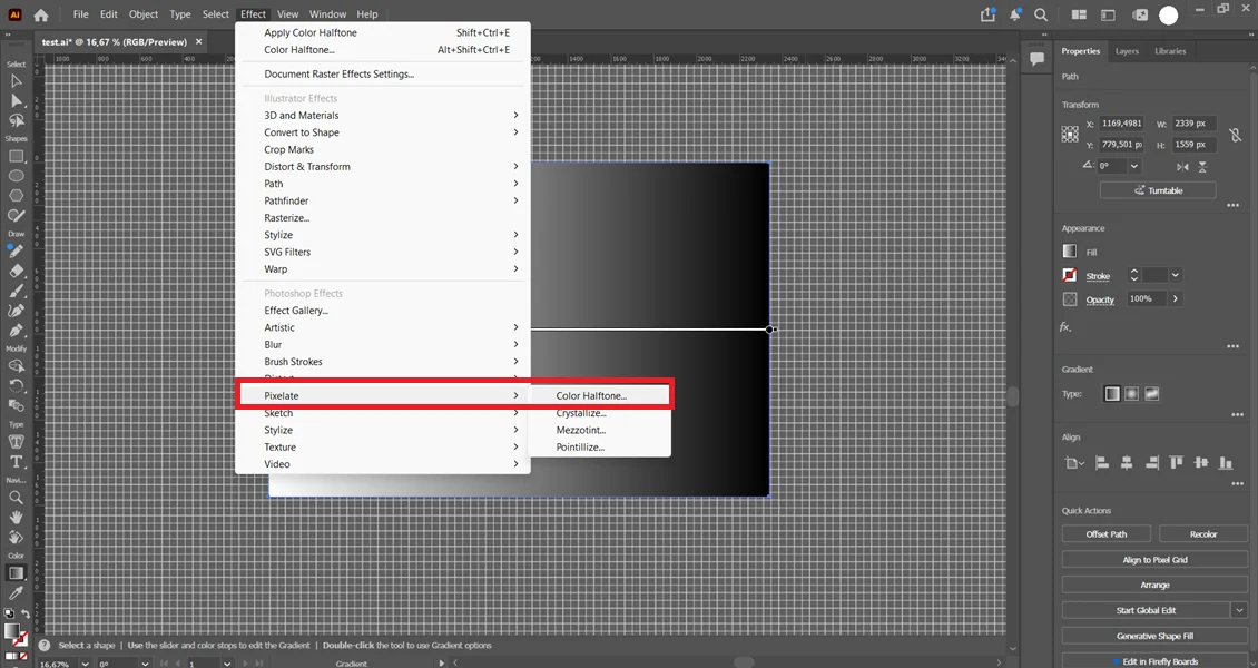
Color Halftone is a raster-based effect, even though you are applying it to a vector rectangle. At this stage you are designing the dot pattern, not generating vector circles.
Step 3 Set the Dot Radius and Screen Angles
In the Color Halftone dialog, enter 32 px for Max. Radius. In the example, each of the four Channel fields is set to 32 degrees. Matching the angles aligns the channel screens for the monochrome result shown in the screenshots. Click OK to apply the effect.
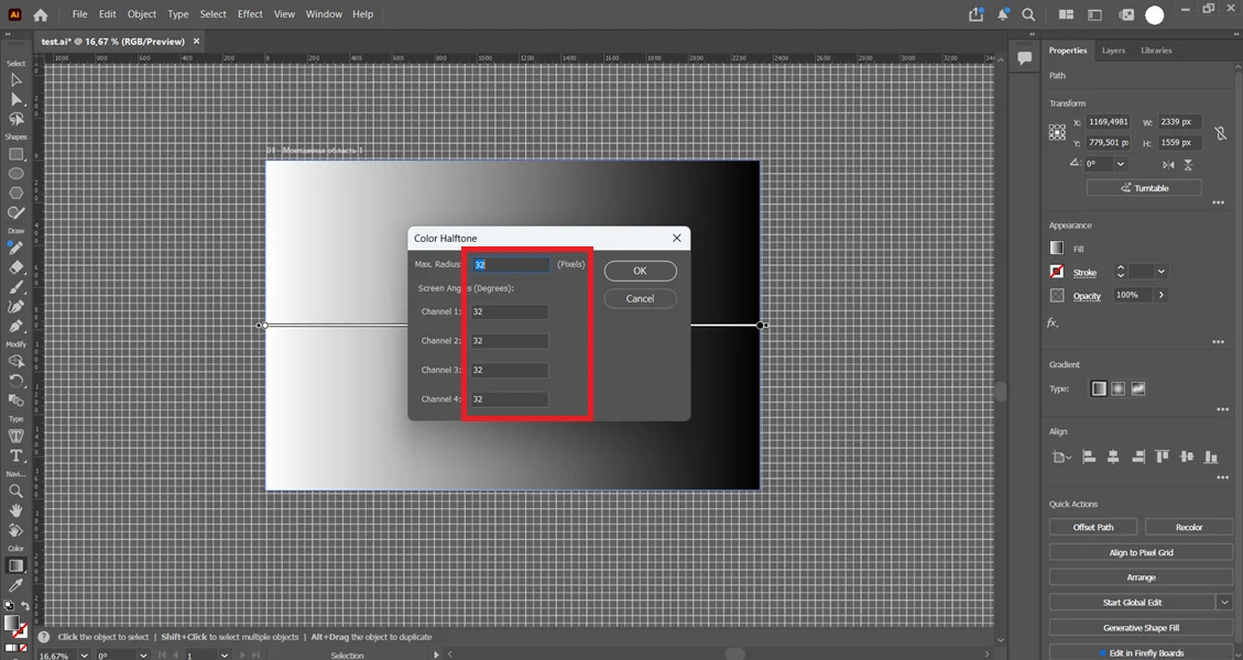
Max. Radius controls the upper size of the dots in pixels it is not a count of dots across the artwork. Try a smaller value for a finer pattern or a larger value for bolder dots. Because this is a raster effect, the document raster effects resolution can also change its detail and tracing result. Set or check it under Effect > Document Raster Effects Settings before you commit to the final artwork.
Step 4 Inspect the Raster Halftone
The gradient now appears as a field of dots. In the screenshot, they start small in the light area and expand toward the black edge. Zoom in and check for clean spacing and the shadow density you want before continuing.
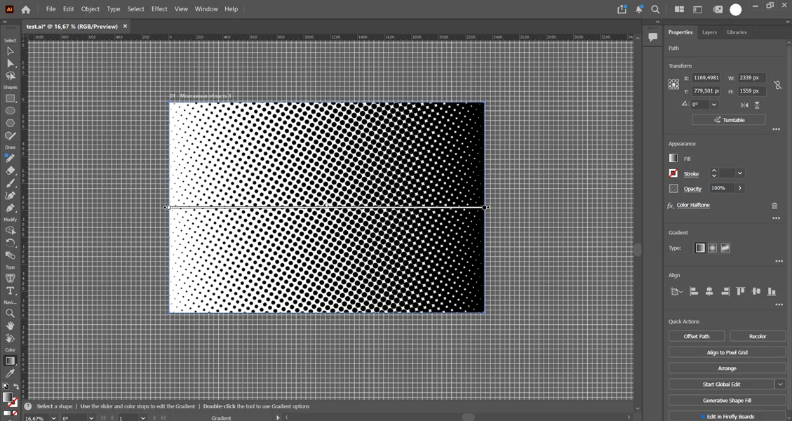
The Appearance panel still lists Color Halftone, which means the effect remains attached to the object. If you want a different dot size, screen angle, or gradient arrangement, make those changes now or return to your backup gradient.
Step 5 Expand the Appearance
Select the halftone artwork and choose Object > Expand Appearance. This commits the live effect to an image that Illustrator can trace. It does not create vector dot paths yet.
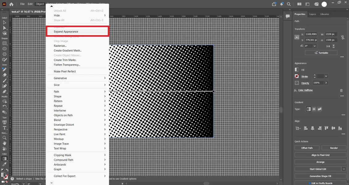
The distinction matters: after this step, the Properties panel identifies the result as an image. If you stop here and save an AI file, the halftone pattern is still pixel based inside that file. Continue to Image Trace for the vector conversion.
Step 6 Trace and Expand the Image
With the resulting image selected, choose Object > Image Trace > Make and Expand, exactly as shown below. Illustrator traces the contrasting areas and expands the trace into paths in one command.
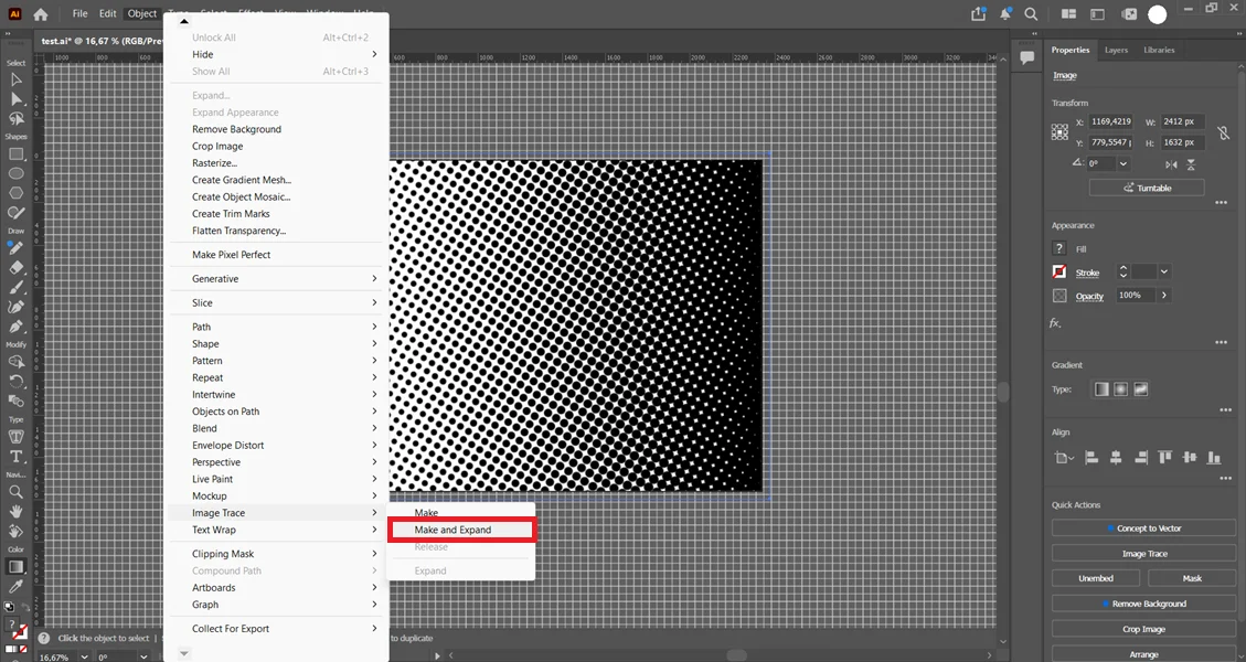
For more control, use Window > Image Trace instead: choose Black and White mode, preview the result, and adjust Threshold, Paths, and Noise before selecting Expand. If you need only dark shapes on a transparent background, select Ignore White or set Ignore Color to white, depending on your Illustrator version. The one-click command in the screenshot does not show those optional adjustments.
Step 7 Check the Finished Vector Halftone
Open the Layers panel and inspect the result. The screenshot shows a traced group, along with a separate rectangle. Choose View > Outline to confirm that the dots are paths rather than pixels return to normal preview when you finish checking.
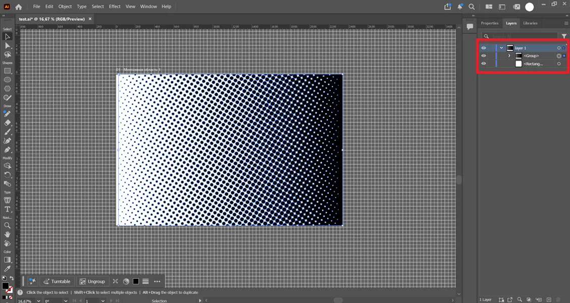
If you want to place the pattern over another color, check whether the trace contains white filled shapes and whether the separate rectangle is a background. Remove or hide only the background elements you do not need. You can then recolor the dark paths, scale the group, or use the pattern in a clipping mask. Where large dots meet at the dark end, the trace may form connected shapes rather than separate circles. For ready-made variations, explore our Halftone Vector Textures.
How the Gradient Changes the Halftone Pattern
The gradient is the tonal map that determines where the dots stay small and where they grow. Its position, direction, and color stops change the overall visual pattern, even if you keep the same halftone settings.
• Reverse the white and black stops to make the dot sizes progress in the opposite direction.
• Drag the gradient vertically to make the pattern grow from top to bottom, or angle it for a diagonal transition.
• Switch to a radial gradient to make the dots expand toward or away from a center point.
• Move the midpoint or add gray stops to keep a region delicate, form a band of larger dots, or soften an abrupt transition.
The gradient changes the distribution of dot sizes it does not by itself set the angle of the dot grid. Adjust the Channel screen angles in Color Halftone if you also want to change the screen orientation. If you want clearly separated circles all the way across, avoid pushing a large region to pure black, where adjacent dots can visually merge. Save the result as an AI or SVG file, and keep the original gradient so you can repeat the process with a different tonal layout.
For ideas on using halftone in a finished layout, read How to Use Texture in Graphic Design.