Articles
Top Graphic Design Trends 2027
A practical forecast for designers, illustrators and creative teams.
Graphic design in 2027 is unlikely to be defined by one dominant look. The more useful shift is toward flexible visual systems: design that can move between brand campaigns, social posts, product screens, editorial layouts and motion without losing its identity. AI will remain part of the workflow, but the work that feels most memorable will still depend on human judgement, clear ideas and a recognisable point of view.
The following trends are a forward-looking guide, not a rulebook. They reflect the directions already shaping visual culture and the practical needs of brands that want their design to feel distinctive, scalable and useful. For designers working with vector graphics, icons and illustration, 2027 should be less about following a style and more about building a visual language that can adapt.
1. AI Becomes a Design Partner Rather Than a Visual Style
By 2027, audiences will be less impressed by an image simply because it was made with AI. The novelty is already fading. What will matter is how well designers use AI to explore directions, speed up repetitive production and test ideas before bringing the strongest version into a finished system.
The useful role of AI is behind the scenes: generating rough concepts, expanding a campaign into variants, finding unexpected compositions or helping teams move from a loose brief to a clearer direction. The final result still needs art direction. Designers decide what belongs to the brand, which details feel intentional and what should be removed. That editing stage is where generic output becomes design.
A practical approach is to treat generated material as raw input. Rebuild the important parts as vectors, adjust the hierarchy, add original type and make the palette consistent. This keeps assets clean, flexible and easier to reuse across print, web and social media.
2. Vector Design Gains More Strategic Value
Vector graphics are especially well suited to the demands of modern design systems. They scale cleanly, are easy to recolour, can be animated and can be adapted into many formats without starting from zero. As brands need more content for more places, these qualities become a real production advantage.
In 2027, stronger vector work will go beyond isolated decorative illustrations. Expect modular scenes, reusable character parts, icon families, background elements and shape libraries that share the same visual rules. A single illustration may become a website hero, a carousel slide, a presentation visual and a short motion asset with only minor changes.
For projects that need this flexibility, a well-organised vector illustration library can give teams a reliable starting point while leaving room for a unique brand treatment.
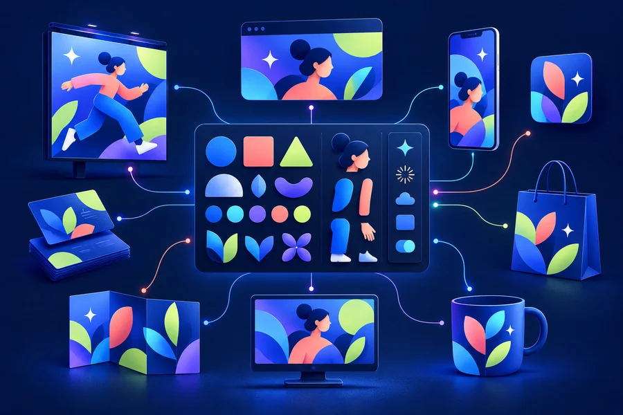
3. Tactile Digital Surfaces Make Clean Layouts Feel Human
Perfectly flat digital design can feel distant when every surface is smooth and every gradient is pristine. One of the most durable directions for 2027 will be controlled imperfection: subtle grain, halftone patterns, paper fibres, scan lines, soft noise and slightly uneven colour transitions.
These textures work best when they support the composition rather than compete with it. A quiet grain layer can make a bold type layout feel warmer. A halftone fade can create depth in a poster. A scanned-paper edge can bring personality to a campaign that would otherwise be too polished. The key is restraint: texture should be visible enough to add atmosphere but not so strong that it harms readability.
Designers can use curated textures and backgrounds as a fast way to introduce this tactile quality, then adjust opacity, blending and colour to match the rest of the identity.
4. Typography Takes a More Expressive Role
Typography will continue to carry more of the visual message. In crowded feeds and fast-scrolling interfaces, a strong typographic idea can communicate before an illustration has time to be understood. Large condensed words, deliberate spacing, oversized numerals and variable type treatments will remain useful tools for building immediate impact.
The trend is not simply to make type bigger. It is to make type behave like part of the composition. Letters can frame an image, create a rhythm with shapes, reveal a texture through a mask or shift slightly between campaign formats. When the type treatment is distinctive, even a simple layout can become recognisable.
The best results will still protect clarity. A headline should be easy to read at mobile size, and supporting text should not be sacrificed for style. Expressive type works when it has a clear job: directing attention, establishing mood or giving a campaign its own voice.
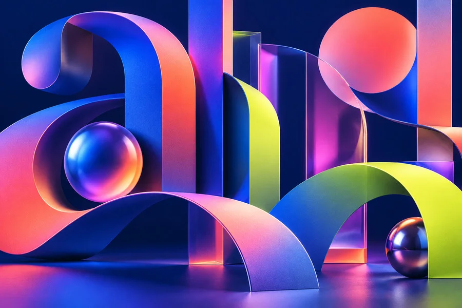
5. Hybrid 3D and 2D Illustration Creates Depth Without Losing Clarity
The divide between flat illustration and 3D rendering is becoming less important. In 2027, many visual systems will combine them: a clean vector scene with one glossy object, a flat background with inflated lettering, or a simple icon set supported by soft 3D accents. This hybrid approach gives designers more ways to create depth while keeping a layout easy to understand.
The strongest hybrid visuals usually have a clear base style. If the main system is flat and graphic, 3D should work as an accent, not take over every element. A few dimensional objects can create focus and contrast too many can make the message feel like a collection of unrelated effects.
For stock assets and brand kits, this is also practical. Vector foundations keep the system editable, while rendered highlights can be used selectively for a hero banner, cover image or promotional post.
6. Mascot Characters Return With More Personality
Mascots and friendly character systems are likely to keep growing, especially for products that need to explain complicated services in a welcoming way. The 2027 version is less about a generic cartoon and more about a repeatable character voice. A mascot can show confidence, confusion, celebration or support across onboarding screens, social posts, email campaigns and help content.
This works particularly well for education, finance, health, productivity and technology brands, where the topic can feel abstract or intimidating. A character gives the audience a human point of connection. It also creates a useful library of expressions and poses that helps a brand stay consistent over time.
The important thing is specificity. A memorable mascot has a clear silhouette, a limited but intentional colour palette and behaviour that fits the brand. It does not need to be complex it needs to feel designed for that one world.
7. Bold Color Is Used With a Clear System
Vivid colour will remain visible in 2027, but random neon combinations are unlikely to feel fresh for long. The more useful direction is colour with structure: a dependable base palette, a small number of high-energy accents and enough neutral space for type and content to breathe.
Expect more electric blues, acidic greens, warm coral tones and digital purples, often balanced by dark navy, cream, charcoal or soft grey. Gradient colour will continue to be useful when it describes depth or movement, not when it is added as decoration by default.
For a practical system, choose one hero colour, one supporting accent and one neutral foundation. Then test how the palette behaves in light and dark layouts, on images, in icons and in small interface elements. A colour trend becomes valuable only when it is usable everywhere a brand needs to appear.
8. Motion Ready Design Is Part of the Brief
Static images will still be essential, but more briefs will assume that a design can move. This does not always mean a large animation project. It can mean preparing assets so that a logo shape can loop, an icon can respond to a hover state, a sticker can bounce in a social post or a background can drift behind a headline.
Designers can prepare for this by working with separate vector layers, clear naming and simple construction. Complex decorative details may look good in one still image but become difficult to animate. Modular shapes, simple depth cues and repeatable transitions make it easier to create motion later without rebuilding the whole asset.
Consistent SVG icon packs are especially useful here because they can support interface states, motion details and responsive layouts from the same visual family.
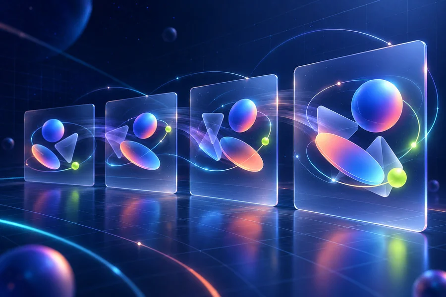
9. Accessibility and Adaptability Become Visible Design Qualities
Accessible design is not a technical checklist that happens after the visual work is complete. In 2027, it will increasingly shape the look of a project from the beginning. Clear contrast, understandable icons, readable type scales and logical information order make design more useful for more people - and usually make it stronger overall.
Adaptability matters just as much. A campaign may need a wide website header, a vertical story, a square social post, an email banner and a compact mobile card. Building a system with reusable components makes these changes feel intentional rather than improvised. This is another reason vector assets, grids and modular illustration elements will remain valuable.
10. Human Taste Becomes the Real Differentiator
As production tools become faster, the ability to choose becomes more important. Anyone can generate many visual options. Fewer people can identify the one that fits a message, develop it consistently and know what to leave out. In that sense, the defining graphic design trend of 2027 may be stronger creative judgement.
The most effective work will combine speed with intention. It will use new tools without looking like a demonstration of those tools. It will be expressive without becoming noisy, efficient without becoming generic and flexible without losing a point of view. That balance is what makes a visual identity feel current and durable at the same time.
How to Apply These Trends Without Chasing Every Trend
Start with the audience and the message, not the visual effect. Choose one or two directions that genuinely support the project: perhaps tactile texture for an editorial campaign, a mascot system for product onboarding, or modular vectors for a content-heavy brand. Then build a small set of rules for colour, type, illustration and spacing.
Use trends as ingredients, not as a template. A good design system should still look like the brand when a trend has passed. When you create reusable vector elements, give them a consistent line weight, shape language and level of detail. When you add texture, apply it with a purpose. When you use AI, refine the output until it carries an intentional human decision.
Final Thoughts
Graphic design trends for 2027 point toward a more flexible and human visual culture. AI will help create faster, but it will not replace the need for ideas. Vector design will become even more useful because it supports scale, adaptation and motion. Texture, typography, colour and characters will remain powerful when they are part of a coherent system rather than a collection of effects.
For designers, the opportunity is to create work that is easy to use across formats and difficult to forget. Build systems that can evolve, keep the visual language clear and let every trend serve the story you want to tell.