Articles
How to Use Photoshop Text Effects in Graphic Design
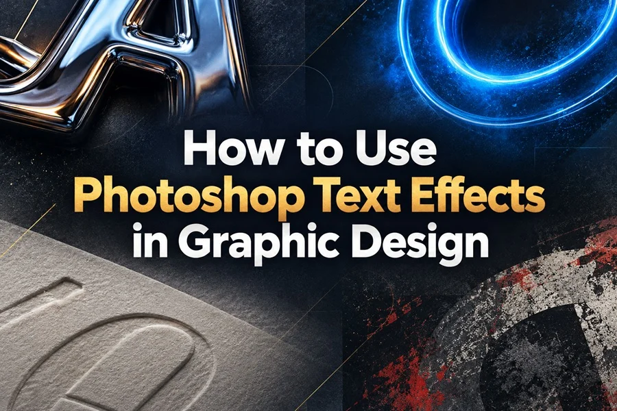
A practical guide to choosing, combining and applying text effects for stronger visual communication.
Photoshop text effects can turn a simple headline into the visual center of a design. They add material, mood, contrast and personality, helping a message feel energetic, elegant, playful, futuristic or dramatic. The best results come from choosing an effect that supports the purpose of the design instead of using a style only because it looks impressive on its own.
This guide explains how to use text effects thoughtfully in posters, branding, social media graphics, packaging and digital campaigns. You will learn how to match the style of the lettering to the audience, background and hierarchy of your composition, then refine the result so that the words remain clear and memorable.
Why Text Effects Matter in Graphic Design
Typography already carries meaning through its size, weight, spacing and shape. A text effect adds another layer of visual information. Chrome reflections can make a title feel polished and modern. Paper texture can make it feel tactile and handcrafted. Glow can create a sense of energy or fantasy, while a rough distressed surface can give a headline an urban, cinematic or vintage edge.
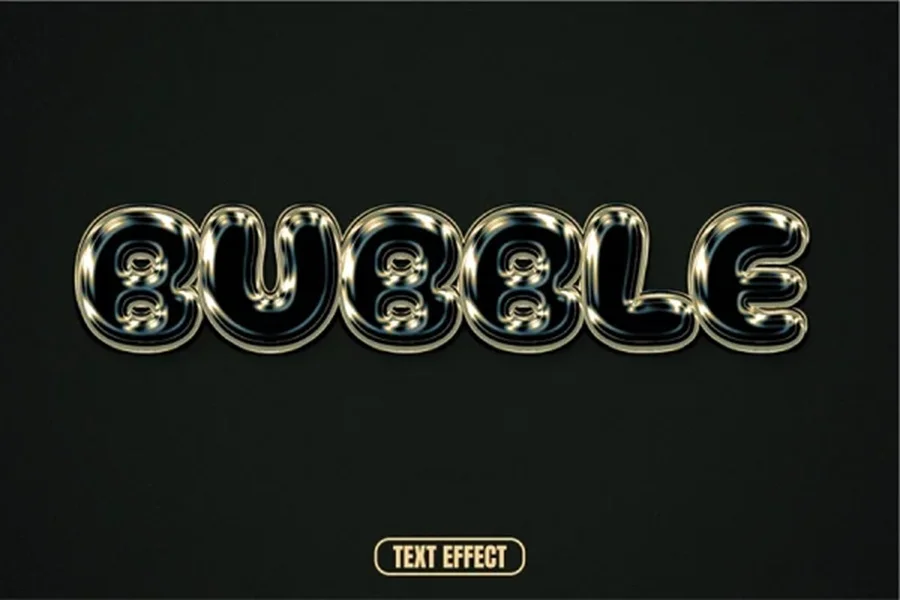
Because viewers often notice a headline before smaller details, the text effect should work as part of the overall message. For example, a shiny bubble style may fit a fashion promotion or pop music artwork, but it would not communicate the same tone as a quiet editorial layout. Thinking about the message first makes the style choice faster and more consistent.
Download Bubble Text Effect
Start With the Purpose of the Design
Before choosing an effect, define what the viewer should feel or do. A poster needs a title that can be read quickly from a distance. A logo presentation may need a distinctive surface that makes the brand feel premium. A social media post needs enough contrast to remain clear on a small screen. An album cover or game title can often be more expressive because atmosphere is part of the product.
Ask three practical questions: What is the main message? Who is going to see it? Where will the design appear? These answers will guide the choice of color, texture, depth and level of detail. A successful effect does not need to be complicated. It needs to make the message easier to notice and understand.
Choose a Text Effect That Fits the Mood
Glossy and Reflective Styles
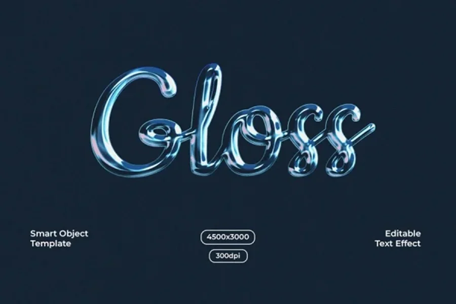
Glossy, metallic and glass-like lettering works well when a design needs a clean, modern or high-end feel. Strong reflections and smooth highlights add visual depth, especially on dark or minimal backgrounds. These styles are useful for fashion graphics, beauty campaigns, music covers, technology promotions and product launches. Keep the surrounding elements simple so the reflective letters remain the main point of focus.
Download Gloss Text Effect
Paper and Tactile Styles
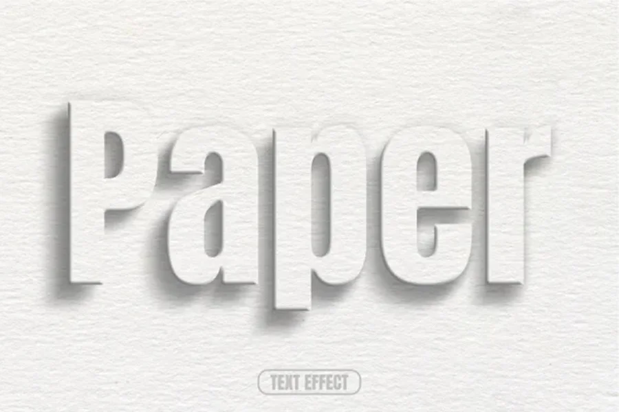
Paper-based effects create a more physical, print-inspired look. Debossed text, subtle shadows and natural fibers can make typography feel calm, elegant and premium. This direction suits stationery, book covers, invitations, packaging, boutique branding and editorial projects. Neutral colors, generous whitespace and soft lighting help this type of effect look believable.
Download Paper Text Effect
Glow and Fantasy Styles
Glowing text is a strong choice for designs that need energy, mystery or a digital atmosphere. Neon edges, luminous color and soft light trails can support fantasy game titles, night events, streaming graphics, sci-fi campaigns and creative social posts. The key is balance: the glow should frame the letters rather than blur their shapes beyond recognition.

Download Magic Text Effect
Textured and Cinematic Styles
Rough textures, worn surfaces and splatter details create a bold cinematic mood. They fit suspense, street culture, action themes, dark editorial visuals, thriller artwork and documentary posters. Use a limited palette and clear contrast so the texture enriches the title without making it difficult to read.
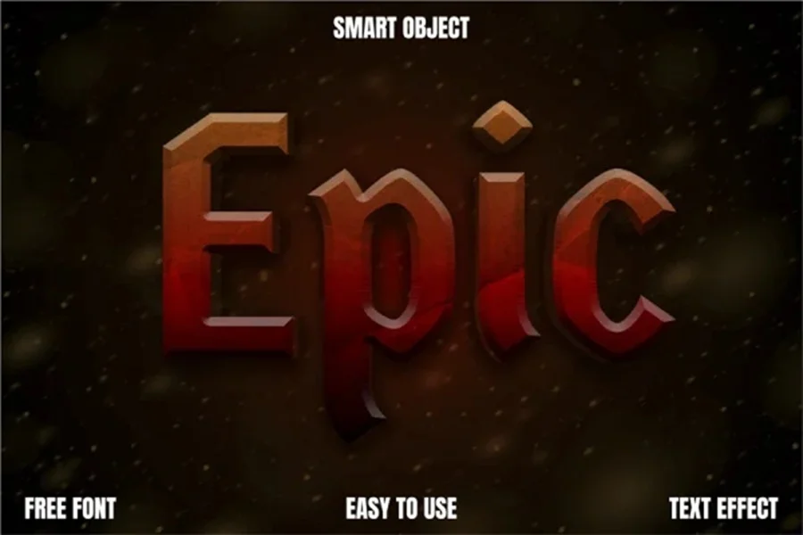
Download Epic Text Effect
Build Contrast Between Text and Background
Even the most attractive text effect will lose impact if it blends into the background. Contrast can come from brightness, color temperature, texture or empty space. A light title can stand out on a deep matte surface, while dark glossy letters can look strong against a warm pale background. If both the letters and background contain busy patterns, reduce detail in one of them.
A useful check is to view the composition at a small size. If the headline still reads immediately, the contrast is working. If the words disappear, increase separation with a darker overlay, a subtle shadow, a stroke, more empty space or a simpler image behind the text.
Use Effects to Create Visual Hierarchy
Not every line of text needs the same treatment. Applying a strong effect to every word can make a design feel crowded. Instead, use the most detailed effect on the main title and keep supporting text clean and simple. This gives the viewer a clear path through the composition: first the headline, then the subtitle, then the details.
For a poster, the event name may use the main effect while the date and location use a neutral sans serif. In a branding presentation, a logo may receive the treatment while the brand statement stays understated. This contrast makes the hero text feel intentional and helps important information stay readable.
Adapt the Effect to the Final Format
A text effect should be adjusted for the space where it will be seen. On Instagram, high contrast and larger letterforms are important because the design is often viewed quickly on a phone. For a print poster, finer surface details can be more visible. For a wide website banner, the effect needs enough space around it so it does not feel compressed at the edges.
Always test the final composition at its intended size before publishing. Check whether the highlights remain clean, whether shadows look natural and whether thin letterforms still hold their shape. Small adjustments at this stage can make the design feel much more professional.
Combine Text Effects With Supporting Elements
Text effects become more convincing when the rest of the composition follows the same visual language. Pair glowing lettering with atmospheric smoke, light flares or dark gradients. Combine a paper impression with soft grain, restrained shadows and quiet colors. Use glossy bubble lettering with smooth curves, bright reflections or minimal graphic forms. Supporting elements should reinforce the effect instead of competing with it.
Textures can also help unite the design. A subtle grain layer may make digital elements feel less sterile, while a stone or concrete surface can add depth to a dramatic title. Use texture with restraint: it should add character without covering the typography.
Work Faster With Ready Made Text Effects
Starting from a ready-made text effect can save time while leaving room for a personal result. Replace the headline, choose colors that fit the project and adjust the composition around the typography. This approach is useful when you need a finished design quickly but still want a strong visual direction.
Explore the Photoshop Text and Photo Effects collection to find styles for posters, branding, social media and other design projects.
Common Mistakes to Avoid
• Using a detailed effect on too much text. Keep the strongest treatment for the main message.
• Choosing a style that does not match the subject or audience of the project.
• Placing textured letters over an equally busy background without enough contrast.
• Adding glow, shadows or reflections so strongly that the letter shapes become unclear.
• Ignoring the final format and testing only at a large working size.
• Forgetting supporting information. Dates, prices and calls to action should remain easy to scan.
Final Thoughts
Photoshop text effects are most powerful when they support an idea. Start with the mood and purpose of the project, choose a style that fits, then build enough contrast and hierarchy for the headline to lead the composition. Whether you use glossy bubble lettering, subtle paper impressions, luminous fantasy styles or rough cinematic textures, the goal is the same: make the message more distinctive without losing clarity.
With a considered choice of type, background and supporting elements, text effects can turn ordinary words into the part of a design people remember.