Articles
SVG Icon Sizes for UI A Practical Guide for Web iOS and Android

Most icon problems are not caused by the icon itself. They happen because a perfectly good SVG is dropped into the wrong size, paired with the wrong stroke weight, or exported without testing it in a real interface. This guide gives designers and developers a practical starting point for choosing icon sizes across web, iOS, Android and desktop products.
The short answer is simple: design the icon in vector, but judge it at the size where people will actually see it. A 24 px source does not automatically look good at 16 px. At small sizes, clarity beats detail every time.
Start With the Job of the Icon
Before choosing a number of pixels, decide what the icon does. Interface icons need to be read quickly beside labels, controls and data. App icons need a memorable silhouette from a distance. Decorative icons can be larger and carry more personality. Treating all three as the same asset is how inconsistent interfaces happen.
• Navigation and toolbar icons should be small, clear and visually quiet.
• Action icons need an obvious metaphor and a generous tap target around them.
• Feature illustrations can use more detail because they are not scanned in a split second.
• App icons follow platform-specific requirements and should be prepared separately from interface icons.
The Core SVG Icon Sizes
For most digital products, five sizes cover the majority of UI work. They are not rigid rules they are dependable checkpoints for testing your icon set.
16 px for dense utility UI
Use 16 px for compact menus, browser-style toolbars, compact tables, file lists and metadata rows. At this size, avoid internal detail, thin gaps and complex silhouettes. If an icon only works when enlarged, it is too complicated for a 16 px role.
20 px for compact controls
Twenty pixels works well for buttons, small navigation and product interfaces that feel slightly more spacious than a traditional desktop toolbar. It is a useful middle ground when 16 px looks cramped but 24 px takes too much visual weight.
24 px as the default UI size
Twenty-four pixels is the safest default for web dashboards, Android-style controls, sidebars and standard mobile interface actions. It gives enough room for a recognisable shape while keeping layouts compact. When a design system has no established icon token, start here and test in context.
32 px for emphasis
Use 32 px when an icon needs to lead a card, empty state, settings group or onboarding step. It can include more character, but it still needs a simple outer shape and consistent visual weight beside smaller icons.
48 px and larger for feature moments
At 48 px and above, icons can support empty states, landing pages and promotional sections. This is where decorative treatment, more nuanced color and supporting shapes make sense. Do not simply scale up a 16 px glyph redraw or refine it so the added space feels intentional.
Use a Grid but Do Not Worship It
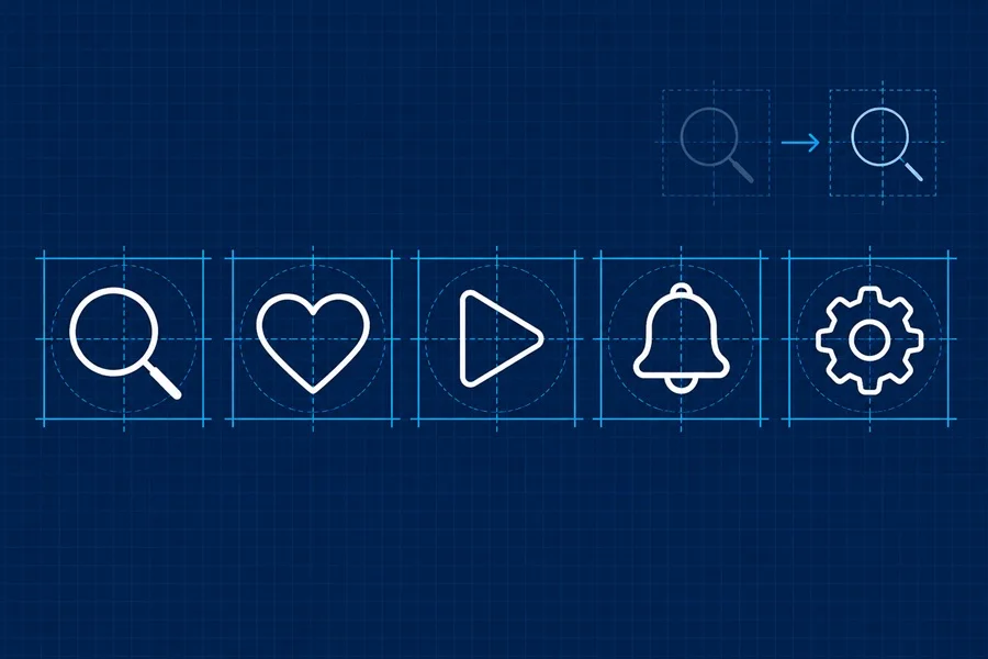
A square artboard keeps a set coherent, but optical balance matters more than geometric equality. A play triangle, a heart and a magnifying glass cannot occupy exactly the same area and still look equally heavy. Center the shapes optically, then compare them side by side at the final size.
Leave breathing room around every symbol. A useful starting point is to keep the main drawing inside roughly 75 to 85 percent of the artboard, then adjust by eye. Rounded or diagonal shapes usually need a little more room than a square or a vertical bar.
Stroke Width and Detail at Small Sizes
The main reason icons feel mismatched is usually not their nominal size it is their visual weight. A thin outlined icon beside a solid one will look weak even when both sit in the same 24 px frame. Choose one approach for the set: filled, outlined, duotone or a carefully controlled combination.
For outline icons, make stroke width a token, not an individual decision. At 24 px, one consistent stroke family is easier to recognise than a collection of technically similar but optically different lines. Reduce detail before reducing the stroke. Tiny holes, doubled outlines and narrow gaps disappear on real screens.
For a practical reference, explore the arrows UI icons pack and compare how a consistent outline language works across navigation, direction and interface symbols.
Web Icons and SVG Export
SVG is the strongest default for interface icons because it scales cleanly and can inherit color from CSS. Export clean paths, remove unused points and test the asset in the actual browser or product component. An SVG can be scalable and still render badly if the viewBox is inconsistent or the path snaps awkwardly to the pixel grid.
• Give every icon a consistent viewBox, usually based on the design-system grid.
• Test at 100 percent browser zoom and at common display scaling settings.
• Use currentColor when the icon needs to follow text or control color.
• Keep filled and outlined variants separate instead of mixing them accidentally.
• Add a text label or tooltip when the meaning is not universally obvious.
iOS and Android Do Not Need the Same Drawing
A shared brand icon set can begin from one SVG master, but platform conventions still matter. Apple and Google both prioritise clarity and consistency within their systems. Android interfaces commonly use a 24 dp baseline for standard icons. On Apple platforms, interface symbols are often adapted to the surrounding typography and system conventions rather than treated as a fixed universal pixel size. App icons are a different asset category again and must follow the current platform export requirements.
The practical workflow is to keep one editable vector source, export platform variants only where the context demands it, and review every important icon in its final component. Do not rely on a single large PNG to cover all densities.
Desktop Interfaces Need Small Size Testing
Desktop software still uses tiny icon sizes in menus, title bars and file views. Windows documentation includes target-size assets such as 16, 24, 32, 48 and 256 px because a symbol that looks fine at one size may not survive scaling to another. For a web app, you may not need all of those exports, but you should test the SVG at comparable sizes before shipping.
A Quick Consistency Check Before Export
• View the complete set in one row at 16 px, 20 px and 24 px.
• Check whether any icon looks darker, smaller or busier than its neighbours.
• Confirm that stroke endings, corner treatment and line caps belong to the same family.
• Check contrast on the real background and in both light and dark mode.
• Test interactive controls with a proper tap or click area. The visible icon can be small while the target is comfortably larger.
• Ask someone unfamiliar with the screen what the least obvious icons mean.
Where to Find Consistent SVG Icons
A good icon library should save time without forcing a different visual language into every screen. Start with a consistent style, download SVG icons when you need to control color and size, and build the interface around a small number of variants.
Final Takeaway
There is no single magic icon size. The right choice depends on the role, platform and available space. Use 24 px as a dependable UI starting point, test 16 px and 20 px for dense controls, and redesign rather than blindly scale when an icon moves into a larger feature role. Consistent visual weight, clear metaphors and real-context testing matter more than the number in the filename.