Articles
12 Best Icon Sets for UI Design 2027
A practical collection of UI icon packs for clear, consistent interfaces.
Icons are one of the smallest parts of an interface, but they have an outsized effect on clarity. A cohesive icon set helps people scan actions faster, recognize controls with less effort and move through a product without stopping to decode the UI. In 2027, clean outlined icons remain a versatile choice because they work across SaaS products, mobile apps, websites, dashboards and editor interfaces without competing with the content.
The twelve icon sets below are organised around common UI needs: core interface actions, users, properties, maps, arrows, messages, editing, devices, files, typography and security. Each set uses a compatible minimal style, so it is easy to keep a product visually consistent while selecting the specific symbols needed for each screen.
Before choosing an icon pack, check that the stroke width, corner treatment and visual density work with your existing components. The best result usually comes from using one core visual language rather than mixing unrelated icon styles throughout an interface.
1. Interface Essentials Icons
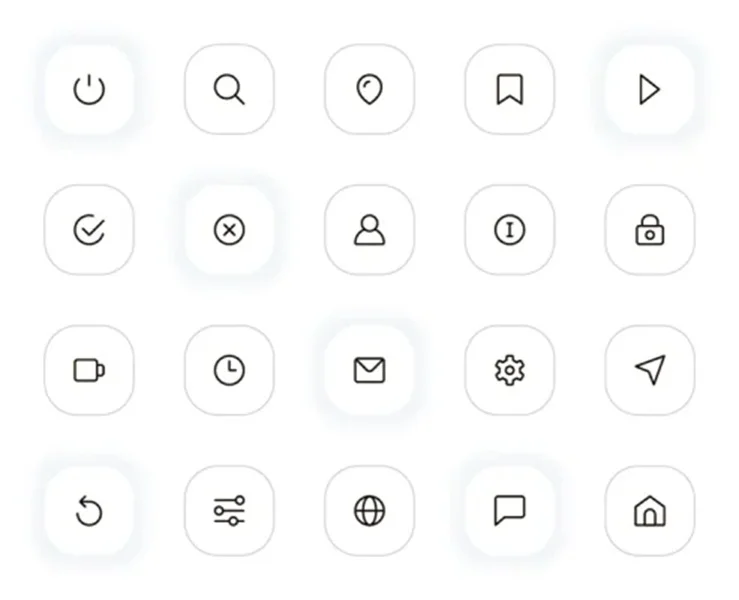
A dependable starting point for almost any product interface. This collection covers the symbols users expect to find in navigation, settings, search, account areas, status feedback and everyday actions. The simple outlined treatment keeps controls calm and readable, especially in SaaS dashboards, mobile apps and web platforms with a light visual system.
Use this set to establish a consistent base layer before adding more specialised icons. It works particularly well for sidebars, top navigation, profile menus and compact action buttons where instant recognition matters more than decoration.
Explore: Interface UI Icons Pack
2. User Account Icons
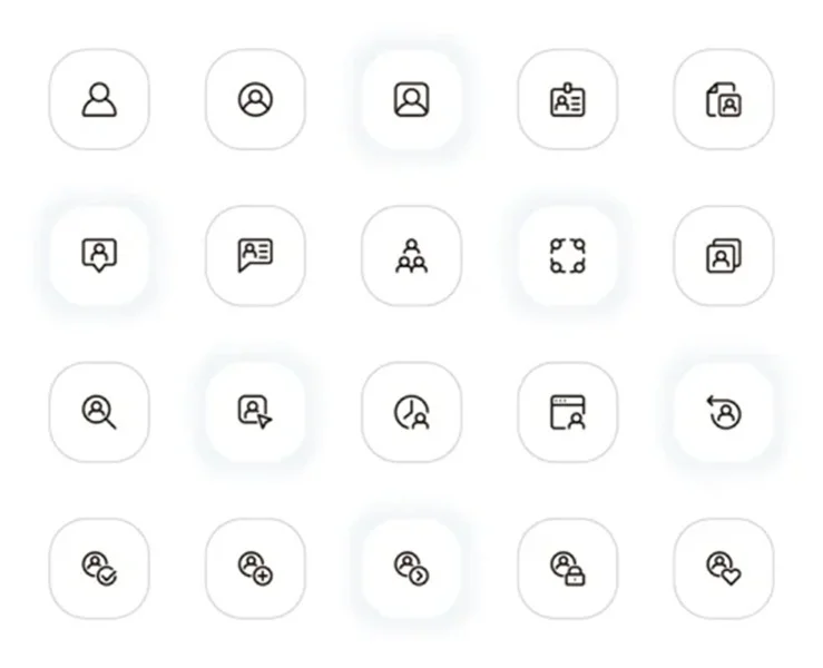
User management needs more than a single profile icon. This set gives product teams a coordinated group of symbols for accounts, teams, invitations, permissions, roles, identity cards and user actions. The repeated stroke weight and rounded icon containers help these controls feel related across screens.
It is a strong fit for CRM products, community platforms, membership areas, HR dashboards and account settings. Place the icons beside short labels in dense admin interfaces, or use them alone in familiar actions such as add user, edit profile and group management.
Explore: Avatar UI Icons Pack
3. Buildings and Property Icons
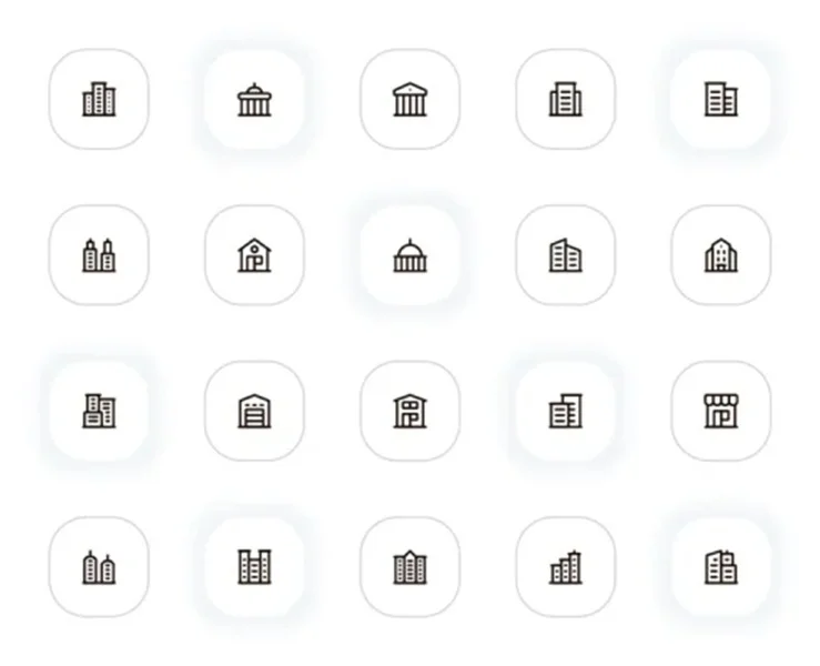
Designed around residential, commercial and civic structures, this pack turns property-related screens into something users can scan quickly. It includes variations for homes, apartment blocks, offices, shops and landmark-style buildings while keeping every asset within one restrained line style.
Choose it for real-estate listings, property-management dashboards, construction portals, local directories or booking products. It is especially useful when filters need to distinguish property types without relying on long labels or photographic thumbnails.
Explore: Building UI Icons Pack
4. Navigation and Map Icons
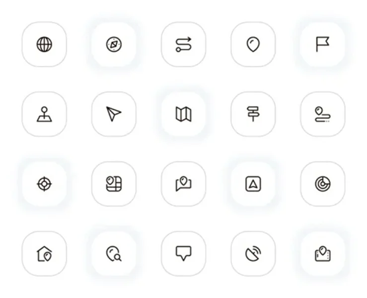
Location tasks benefit from symbols that are legible at small sizes. This set includes pins, routes, maps, compass-inspired controls, target points and destination markers, all drawn with the same clean outline language. The variety gives designers enough options for both map views and supporting interface controls.
Use it in delivery apps, travel services, event pages, store locators and logistics dashboards. Keep map-related controls visually connected by using one set for the route button, location field, nearby filter and destination status.
Explore: Navigation UI Icons Pack
5. Arrows and Diagram Icons
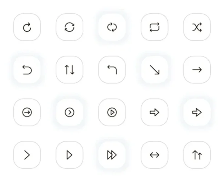
Arrows are small details that shape how an interface feels. This collection includes directional arrows, return and refresh controls, swap actions, playback arrows and diagram-friendly pointers. Its consistent geometry makes it easier to use different arrow types on the same screen without creating visual noise.
It is useful for flows, pagination, carousels, process diagrams, media controls, sortable lists and conversion actions. For a clearer UI, reserve one arrow treatment for navigation and use the stronger directional icons for actions that change content or move data.
Explore: Arrows UI Icons Pack
6. Email and Message Icons
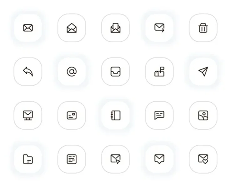
Email, inbox and communication features need symbols that communicate state at a glance. This pack covers messages, mailboxes, send actions, addresses, replies, attachments and conversation controls. The icons are compact enough for toolbars but still detailed enough to guide users through communication workflows.
Use it in newsletter editors, help desks, contact modules, client portals and email-style dashboards. It also works well for empty states or onboarding screens when a short explanation needs a small, supportive visual cue.
Explore: Email UI Icons Pack
7. Content Editing Icons
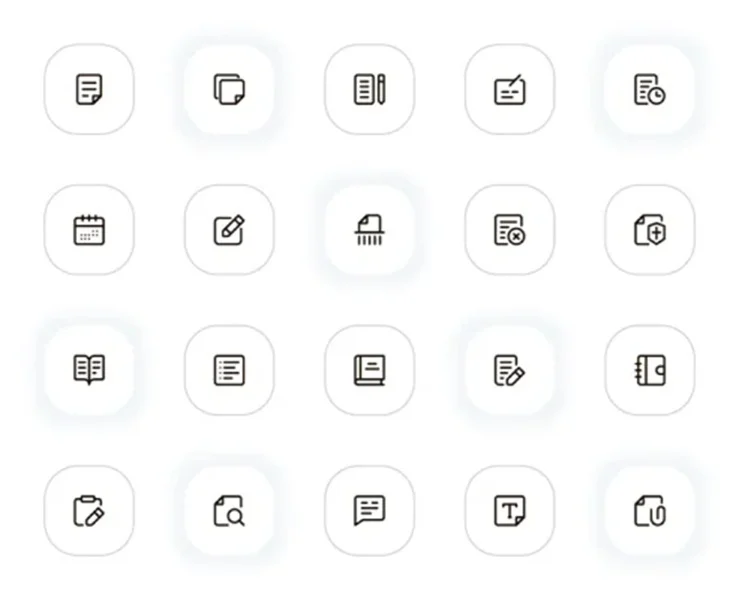
This collection is built for the working parts of a CMS, document editor or publishing interface. It includes document, note, calendar, annotation, text and edit symbols that make creation tools feel clear rather than intimidating. The icons share a practical, neutral character that suits professional software.
Add these assets to content calendars, article editors, task panels, asset libraries and moderation views. They are most effective alongside clear action labels, such as Edit draft, Schedule post, Review content or Add note.
Explore: Content Edit UI Icons Pack
8. Photo Editing Icons
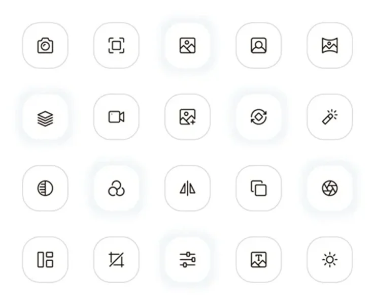
Photo workflows often require many controls in a very small amount of space. This set brings together camera, crop, image, layers, filters, lighting and adjustment symbols in one compatible system. The clean strokes remain readable in panels, toolbars and compact mobile editing menus.
Use it for image editors, creative dashboards, asset-management tools, social-media schedulers and photography portfolios. Because the collection covers both capture and post-production, it can unify an interface from upload screen to final export.
Explore: Photo Edit UI Icons Pack
9. Computers and Device Icons
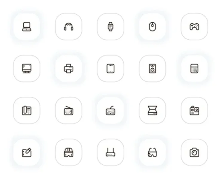
A product dealing with hardware, devices or technical support needs icons that are specific without looking overly complex. This pack includes computers, laptops, headphones, wearables, displays, peripherals and network-related equipment in a consistent lightweight line style.
It fits software download pages, device-management panels, IT support portals, e-commerce filters and technology comparisons. Use the icons to separate device categories, explain compatibility or help users identify where a setting applies.
Explore: Devices UI Icons Pack
10. File Management Icons
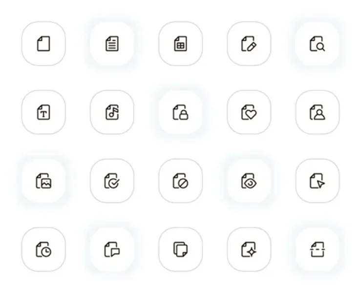
File actions are among the most repeated interactions in modern software. This collection covers common document states and actions such as create, edit, search, protect, share, favourite, duplicate, history and more. Keeping these familiar commands in one visual family makes a workspace easier to learn.
Use it in cloud storage products, document libraries, upload flows, media managers and collaboration tools. Pair the icons with concise labels when the action is less obvious, and use the more familiar symbols alone in repeated toolbar controls.
Explore: Files UI Icons Pack
11. Typography and Text Icons
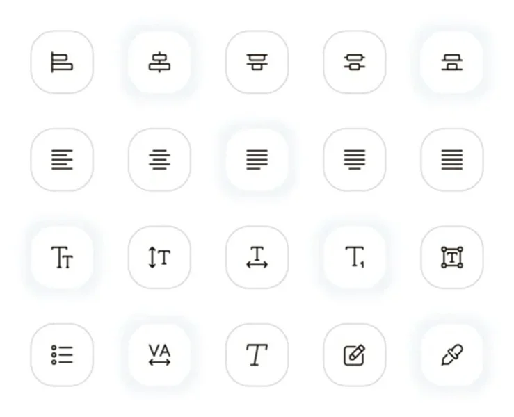
Typography controls can quickly become inconsistent when they are assembled from different sources. This set brings alignment, paragraph, text size, spacing, link and list icons into one orderly visual system. It gives formatting panels a more polished appearance while helping users locate familiar controls faster.
It is ideal for rich-text editors, email builders, presentation tools, website builders and knowledge-base platforms. Use the icons beside tooltips or labels when designing for newer users, then reduce the visible text as the interface becomes more familiar.
Explore: Type UI Icons Pack
12. Security and Protection Icons
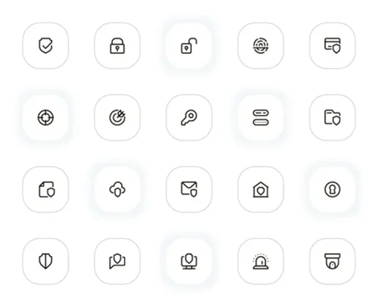
Trust-related actions deserve their own clear visual language. This set combines shield, lock, key, password, verification, alert and privacy symbols with a clean UI-friendly outline. It can support security messages without making a product feel heavy or alarmist.
Use these assets for login screens, two-factor authentication, payment areas, privacy settings, account recovery and access-control dashboards. Consistent security symbols help people understand when an action is protected, needs verification or changes their account permissions.
Explore: Security UI Icons Pack
How to Choose a UI Icon Set
Match the visual system. Choose icons with a stroke width and shape language that feel natural next to your buttons, inputs and typefaces. A polished interface is usually more consistent than it is decorative.
Prioritise recognition. Use familiar symbols for familiar tasks. When an action is new or could be unclear, show a short text label or tooltip alongside the icon.
Design for small sizes. Preview icons in the actual context where they will appear. A detailed mark that looks good in a large preview may lose meaning in a 16 or 20 pixel toolbar.
Keep room for states. Plan how the icon will look when it is active, disabled, selected or paired with a notification badge. A consistent source pack makes these interface states easier to manage.
A well chosen icon set makes an interface feel more deliberate from the first screen to the final confirmation. Explore the collections above, choose the symbols that match your product’s real tasks and keep the visual language consistent as the UI grows.