Articles
Color Palette Trends 2027: 10 Modern Design Palettes
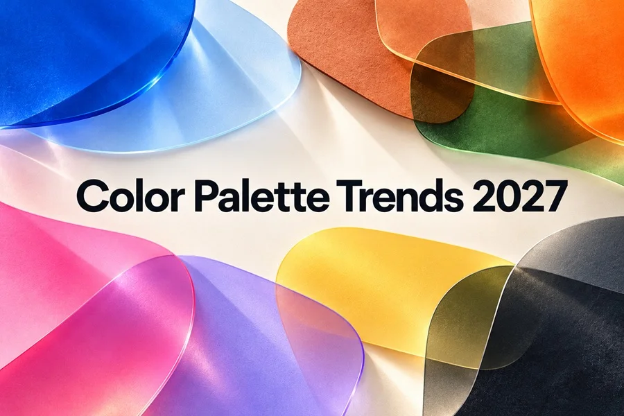
Color is moving toward more feeling, personality, and contrast in 2027. This guide collects ten practical palettes with web-ready HEX codes, plus simple ways to use them in branding, social media, websites, packaging, and vector design.
Color trends are becoming more expressive
For a few years, many digital designs relied on safe neutrals, muted pastels, and the same familiar blue gradients. In 2027, color is becoming less anonymous. The strongest direction is not one single shade, but a balance between two moods: grounding colors that feel natural and reassuring, and bright accents that add energy, humor, or a digital edge.
That balance makes sense for contemporary visual communication. A warm clay neutral, a deep green, or a softened blue can make a brand feel considered and human. A flash of orange, pink, acid yellow, or electric cyan can give the same design a memorable focal point. The best palettes below are therefore designed as systems, not just as attractive swatches: each includes a background, a supporting tone, a contrast color, and an accent.
How to use this guide
Use the palettes as a starting point rather than a rule. Keep one shade in charge, give text a calm background, and reserve the most intense color for buttons, key words, illustrations, badges, or calls to action. When you need a different file format or want to fine tune a shade, convert the HEX values with a HEX to RGB converter before building your final assets.
1) For websites and user interfaces, use the darkest and lightest colors for readable text and backgrounds.
2) For social media, let the accent color occupy a small but high-contrast area so the post remains easy to scan.
3) For vector illustrations, repeat two or three colors across objects to make a set feel cohesive.
4) For print, convert the selected palette to CMYK and proof important colors before production.
Ten color palettes for 2027
Each palette below has a clear role: three colors for the visual system and one dark ink color for text, outlines, navigation, or contrast. The HEX values are practical web selections, not official proprietary color specifications.
| Palette | Color 1 | Color 2 | Color 3 | Ink |
|---|---|---|---|---|
| Luminous Blue and Soft ClayCalm technology, creative tools, editorial layouts | #3457A4 | #B9D7E8 | #E5B6A0 | #1E2A3A |
| Meadowland Green and ApricotWellness, food, sustainable brands, outdoor products | #53765A | #AFC7A1 | #F0A57A | #283A2E |
| Energy Orange and InkCampaigns, sports, events, youth brands | #F06A28 | #FFC48C | #122238 | #FFF8F0 |
| Pop Pink and Digital PlumBeauty, music, entertainment, creative portfolios | #F36FA4 | #8B4E7C | #321B3F | #FFF8FB |
| Quiet Teal and Pepper WhiteInterior, lifestyle, editorial, premium services | #4F9292 | #B9D9D5 | #F4F1E8 | #263638 |
| Cherry Red and Powder BlueFashion, food packaging, playful branding | #B93647 | #B6D7ED | #FAE6DB | #30272B |
| Mineral Violet and CitrusTech products, campaigns, bold digital interfaces | #6B5CA5 | #C8C3EA | #E6F04A | #24213A |
| Heritage Brown and Wild AsterCraft, home goods, ceramics, boutique brands | #6C4535 | #C9897A | #D3A5B1 | #332722 |
| Ocean Glass and CoralTravel, summer campaigns, social media content | #238EAF | #A8DFE6 | #FF7E6B | #173B4A |
| Graphite and Electric LimeSports, technology, gaming, standout calls to action | #24272C | #6C747A | #C8F44C | #FFFFFF |
Palette notes
1 Luminous Blue and Soft Clay
A rich blue gives this palette confidence without looking cold. Soft clay introduces warmth, while pale blue and off white keep the composition open. Use the dark navy for body text, clay for tags or icons, and the main blue for key actions.
2 Meadowland Green and Apricot
This is a fresh natural palette without the usual forest green cliche. Meadow green becomes the stable base, while apricot brings sunlight and personality. It works especially well with flat botanical shapes, packaging labels, and friendly product cards.
3 Energy Orange and Ink
High energy does not have to mean visual chaos. Ink blue gives orange a serious partner, and the pale tints prevent the layout from becoming too loud. Use orange only where you want the eye to land first: a button, price, date, or single illustrated object.
4 Pop Pink and Digital Plum
Pink is moving away from delicate sweetness toward bolder self expression. The plum base makes it feel more grown up, while the pale blush creates breathing space. This combination is ideal for large type, playful stickers, gradients, and expressive portrait-based posts.
5 Quiet Teal and Pepper White
Quiet teal is sophisticated because it is neither too blue nor too green. Pair it with an almost white warm neutral and a muted gold accent for a palette that feels polished but not distant. It is a strong choice for landing pages that need a calm premium tone.
6 Cherry Red and Powder Blue
Unexpected contrasts will remain important in 2027, and red with powder blue is one of the easiest ways to create them. The warm cream and light peach prevent the pair from feeling retro in the wrong way. Try it in a poster or packaging design with one oversized red element.
7 Mineral Violet and Citrus
Mineral violet adds depth and a subtle futuristic mood, while citrus yellow creates instant attention. The secret is restraint: let violet hold large areas and use citrus for tiny details, active states, or highlight strokes. This palette has a particularly strong presence in dark mode interfaces.
8 Heritage Brown and Wild Aster
Modern heritage is not about copying the past. It is about using colors with a sense of material, craft, and permanence. Brown grounds the layout, dusty pink softens it, and terracotta keeps it warm. Use this palette with paper textures, line art, or understated serif headlines.
9 Ocean Glass and Coral
Ocean blue remains versatile when it is paired with a human color rather than another cool shade. Coral gives the palette movement and makes it useful for calls to action. It can support travel collages, product launches, beach themed graphics, and optimistic brand storytelling.
10 Graphite and Electric Lime
For designers who need a clean high-contrast direction, graphite and electric lime deliver clarity. The neutral framework feels professional the lime accent makes interface states and small elements easy to notice. Use generous white space so the acid tone stays intentional instead of tiring.
How to make a trend palette work for your brand
A palette can be current and still feel wrong if it ignores the purpose of the project. Start with the message you want people to receive. A financial service may borrow a warm neutral and a confident blue from the 2027 direction, but it should not use pop pink as its main interface color. A music event can do the reverse and let the expressive accent dominate. Trend colors should sharpen a brand personality, not replace it.
It also helps to assign roles before you start designing. Choose one dark or high contrast color for text and essential navigation, one light color for the main canvas, one primary brand color, and one accent. If a palette has five colors, you do not have to use all five in every asset. Consistency usually comes from repetition, not from displaying every available swatch.
Check contrast before publishing
Beautiful color is not enough if the content becomes hard to read. Avoid placing pale text on a light photo, use more than color alone to show an error or status, and test small text against its background. On a website, a simple contrast check should be part of the final design review. It protects usability and usually makes the page look more confident as well.
Final thoughts
The color palette trends of 2027 are less about following one mandatory shade and more about choosing a clear emotional direction. Grounded greens, mineral blues, clay neutrals, heritage browns, and softened whites build trust. Orange, pink, coral, citrus, and electric lime bring moments of delight and energy. Combine those two worlds with intention, and a design can feel current without becoming disposable.
Save the palettes that match your project, adapt the HEX values to your own brand system, and use them consistently across graphics, icons, backgrounds, and social content. A well chosen color system makes even a simple vector design feel deliberate, recognizable, and ready for 2027.